
Vintage Collectors' Club Vol. 1: Portrait History is Neat-- Crayon Enlargement Portraits and the Victorian Era
Welcome to our first volume of Silk and Sage Design’s “Vintage Collectors’ Club”— a place to highlight our vintage and antique inventory, coupled with blog posts sharing the history behind some of our most unique and beloved finds, design trends throughout time, and related interesting subjects. Everytime we add a new vintage or antique find to our shop, we do a deep dive to find out the history behind it when that’s even available… we’re thoroughly interested in knowing where items came from, who they were made by, what art or design movements they were created from, and more. While vintage, antique, and even some unique contemporary pieces will be featured as physical inventory in our Vintage Collectors’ Club available to purchase through us in-store and online, only some special items will be featured on our blog. Dive in today for our first exploration!
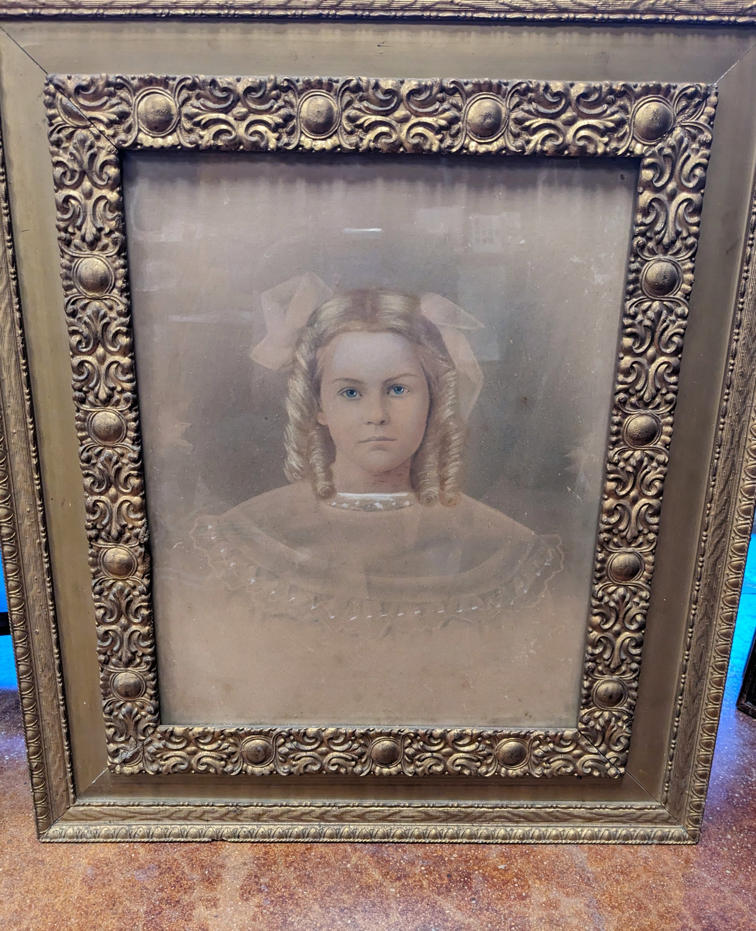
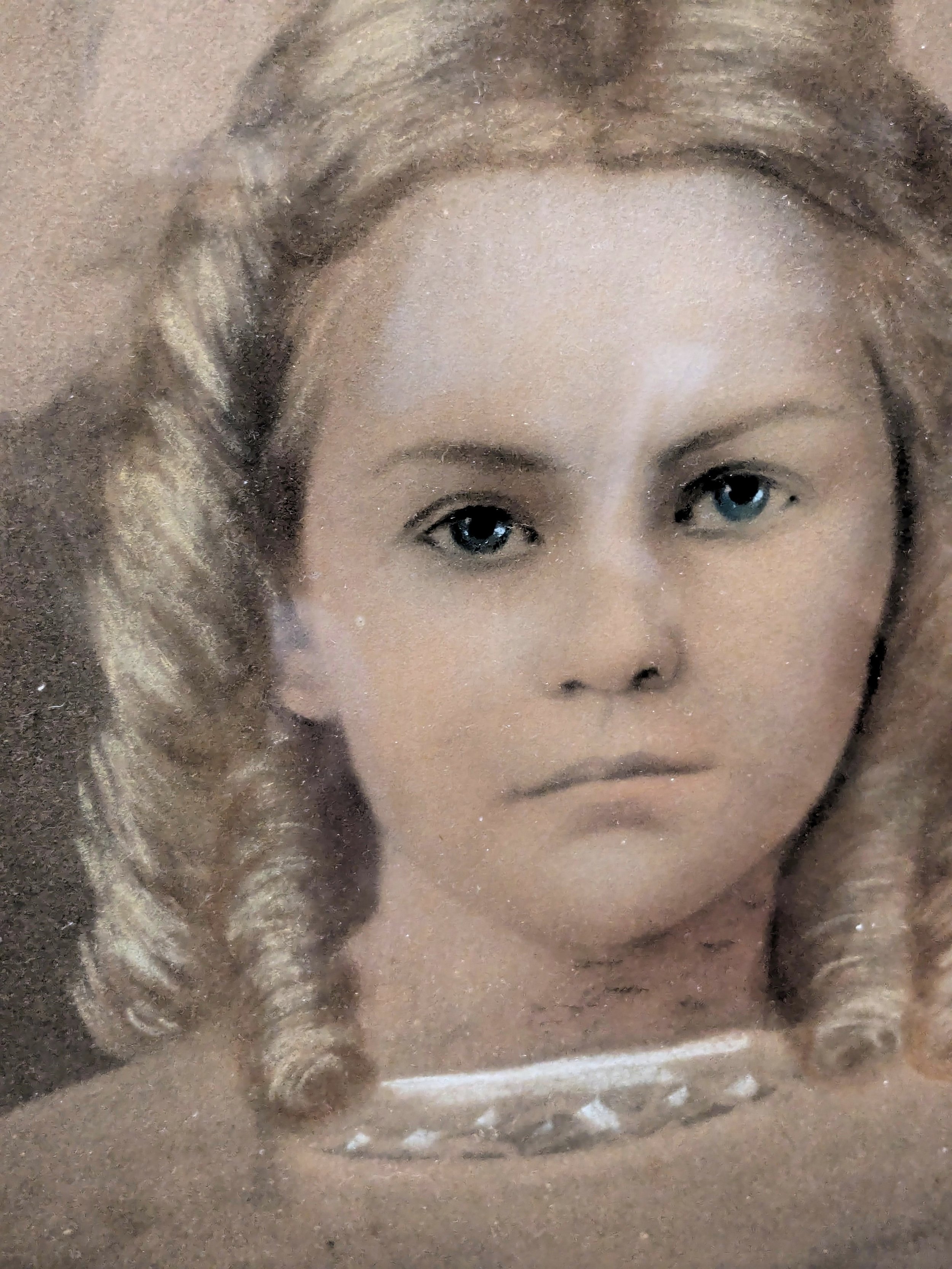
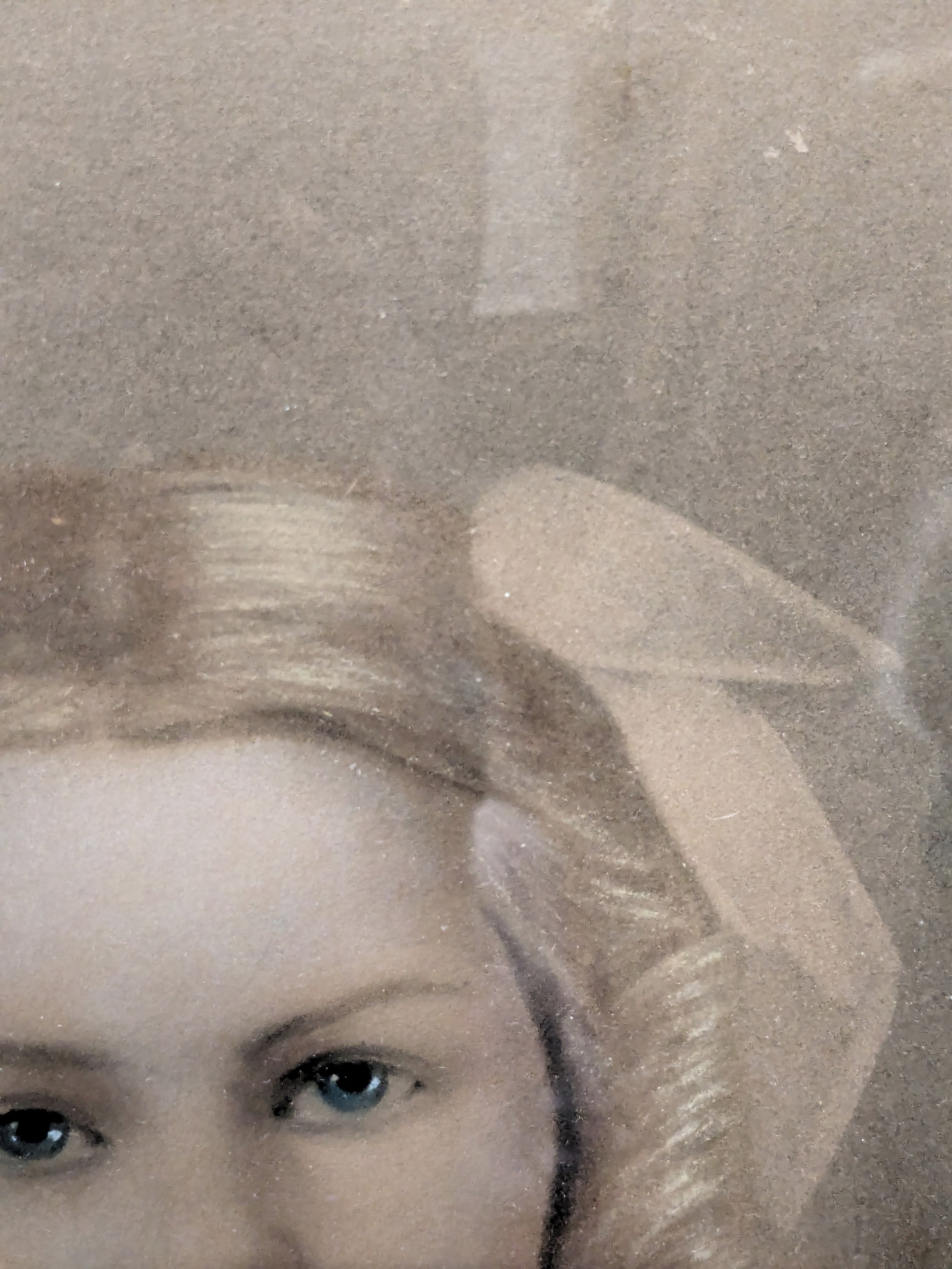
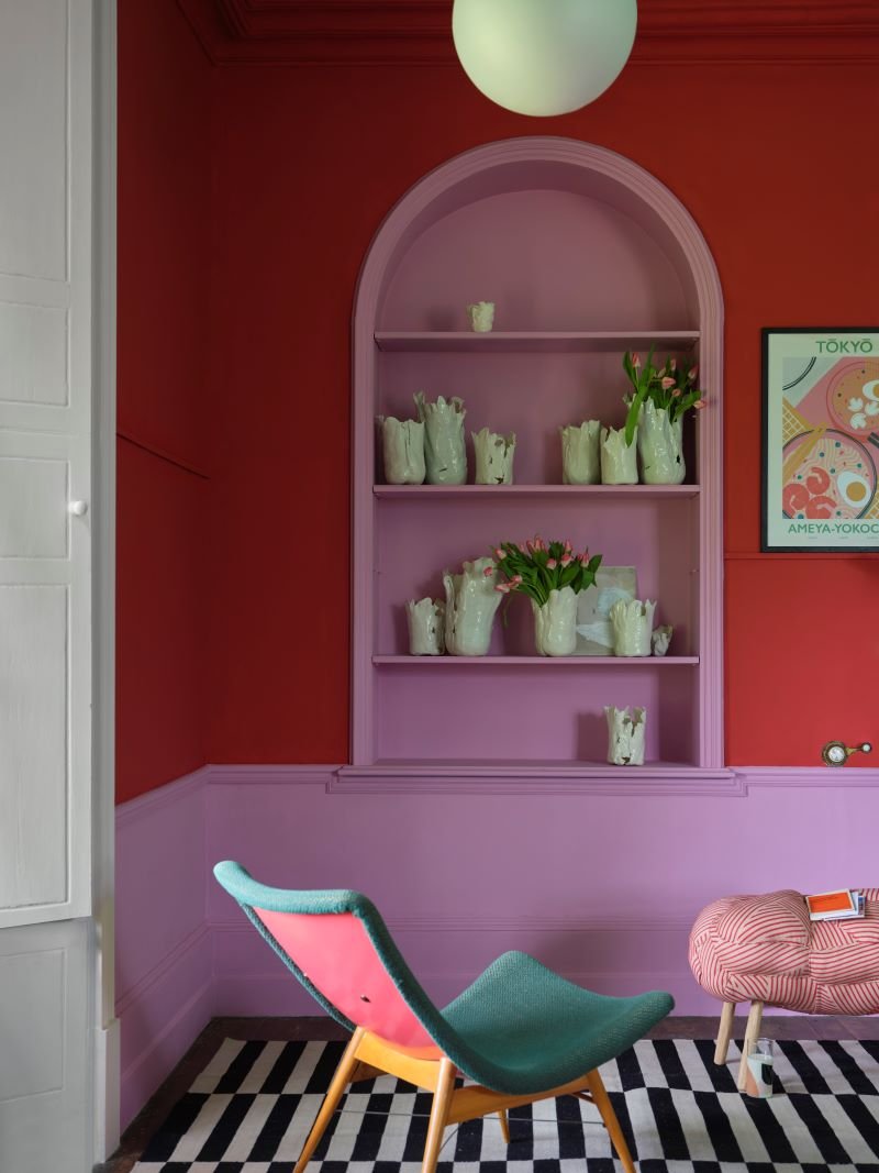
When we found this portrait of a young girl, it was love at first sight. Some may say ‘CREEPY!!’ but to us, she seemed like someone that was deeply loved enough to have a portrait commissioned of her. While we can’t see her entire dress, the little hints trailing outward on the portrait make us imagine what beautiful gown she wore on the day of her portrait, how long it took to have her hair curled into ringlets, and on and on and on…
BUT the overarching question that came up constantly in the beginning was whether this portrait was a photographic print, a multi-media art print, or both. Could it be both? There were enough traits within the portrait that conveyed both processes. So off to the art history archives we went! Firstly, we’ll say that there are two interesting historical elements coming up with this portrait— what media was used, and then the background on the portrait industry around the time it was made. We’ll start by expanding on the portrait process used, and then later we’ll come back to what the portrait industry used for ‘marketing tactics.’
Based on the girl’s clothing and hair, her portrait was likely completed very late 1800s-early 1900s, meaning at the tail end of the Victorian Era. During this time, use of photography was more widespread than when it was first introduced earlier in the 19th century (while we won’t get into the entire history of photography today because there is just SO much to cover, we’ll talk about some of its history in context with that of portraiture).
The commissioning of portraits was also becoming much more affordable and accessible with the increased popularity of photography. Previously for a patron to have a portrait commissioned, they needed to be wealthy. Portraits were typically sat for over different sessions and were created by hand by the artist, often painted. Think of the grand, massive portraits you may have seen in museums, manors, and other stately places. Thanks to the rapid changes in society throughout the 19th century (the Industrial Revolution, changing schools-of-thought in the arts and culture), people yearned for more accessibility with all consumer goods at this time.
Many people became increasingly interested in photography— it was new, it was interesting, it was hot! However, photography alone was not considered by many to even be an art form until the late 1800s, meaning that photography tended to be seen as a mechanical process and its portraits were viewed as more utilitarian and simply photographic prints. Color being added to photo prints was not uncommon either (like with hand-colored ambrotypes and daguerreotypes), however it still was within the confines of a mechanically-derived photo print. Consumers and artists alike still yearned for the soft, artistic touches of hand-done portraits, the ‘artistic portrait’. During the mid 1800s, different photographer-artists came up with a few similar technologies that created portrait processes which combined photography with more traditional ‘artistic portraiture’ skills, birthing the likes of processes such as Crayon Enlargements and Photo-Crayotypes.

(example of a daguerreotype with light touches of pinkish color on the cheeks)
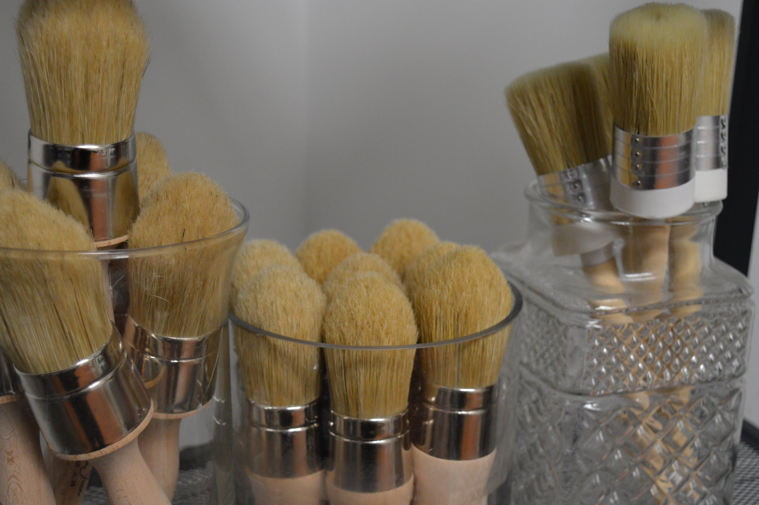
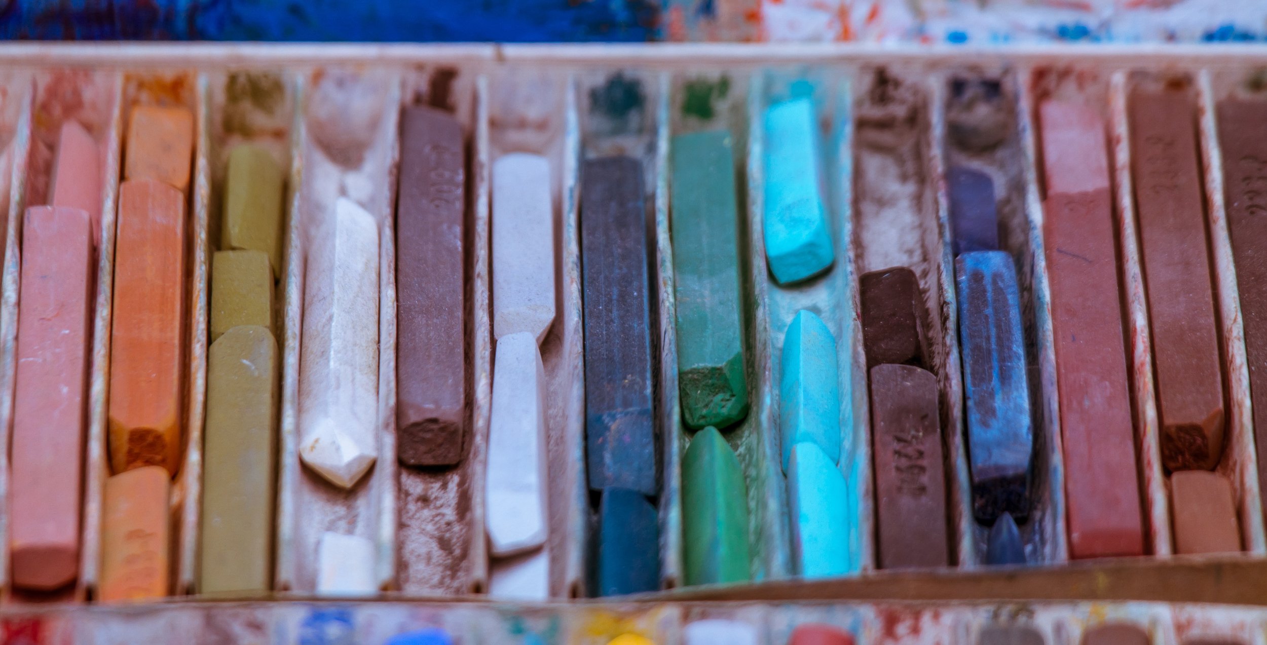
These newer combined-types of ‘artistic portrait’ processes involved photos essentially being ‘enlarged’ onto or underneath paper as traceable images. Sometimes solar methods were used for the image enlargement projections (especially in the early days of these new processes), while other mechanical apparatuses were sometimes used for the enlargements. Artists were then able to ‘trace’ over the images as reference, while using their own skills and touches to add color, flourishes, and more. Oil paints, pastels, crayons, and charcoal were most commonly used. While it’s not uncommon to see Crayon Enlargements that are predominantly done in charcoal with just a little bit of color added, color and ‘softness’ of a hand-touch were highly desired as these were what defined these new portrait styles from a more mechanical photography in most views. See, while the groundwork for true color photography was starting to develop as early as the late-1800s via different methods, the world wouldn’t see its popularity until the 20th century. With the advent of Crayon Enlargement Portraits, consumers could have a more affordable portrait process available to them, combining it with some of the most desired commodities of the time— artistic, soft touches of hand-done portraits and use of photography!
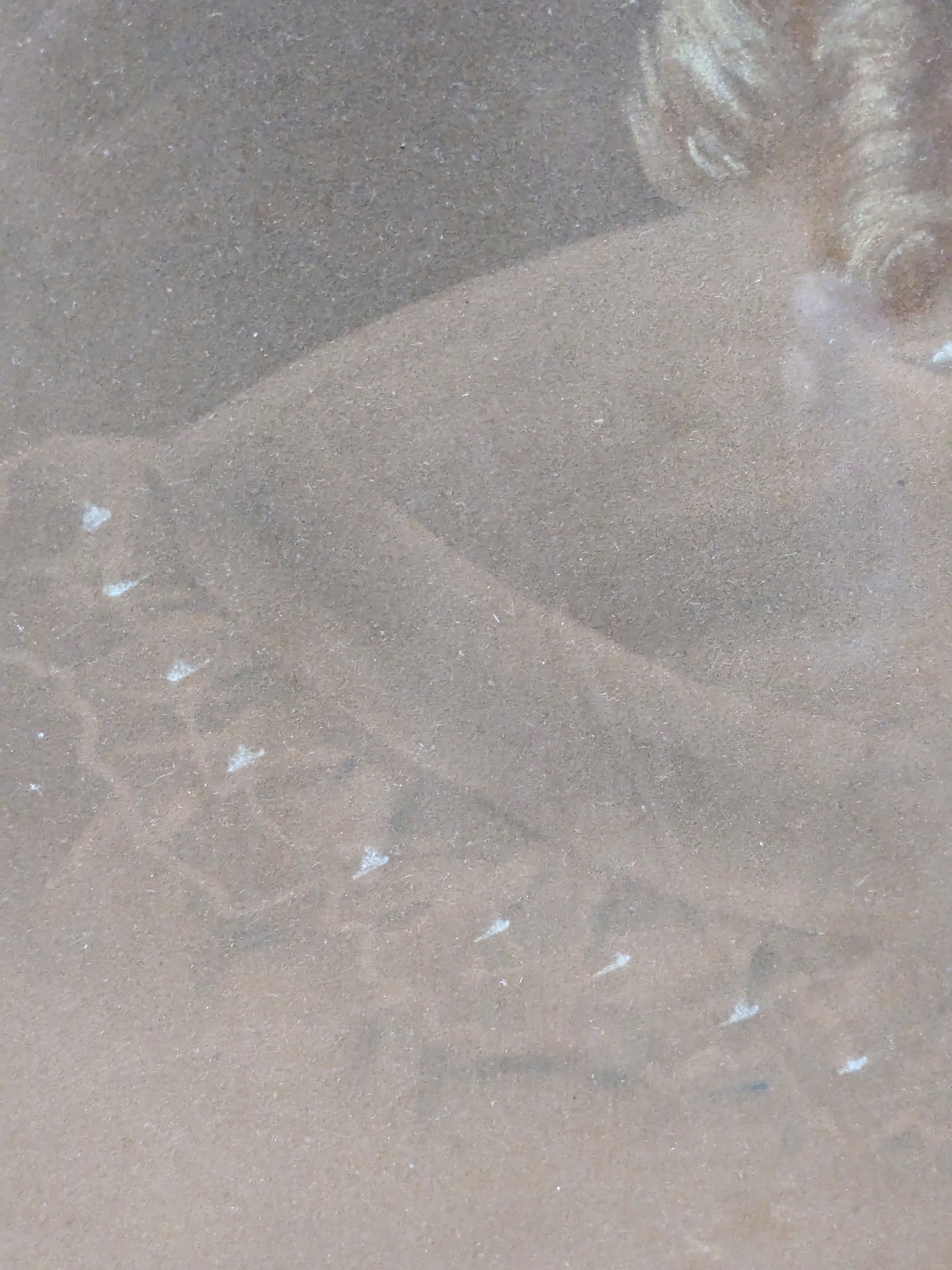
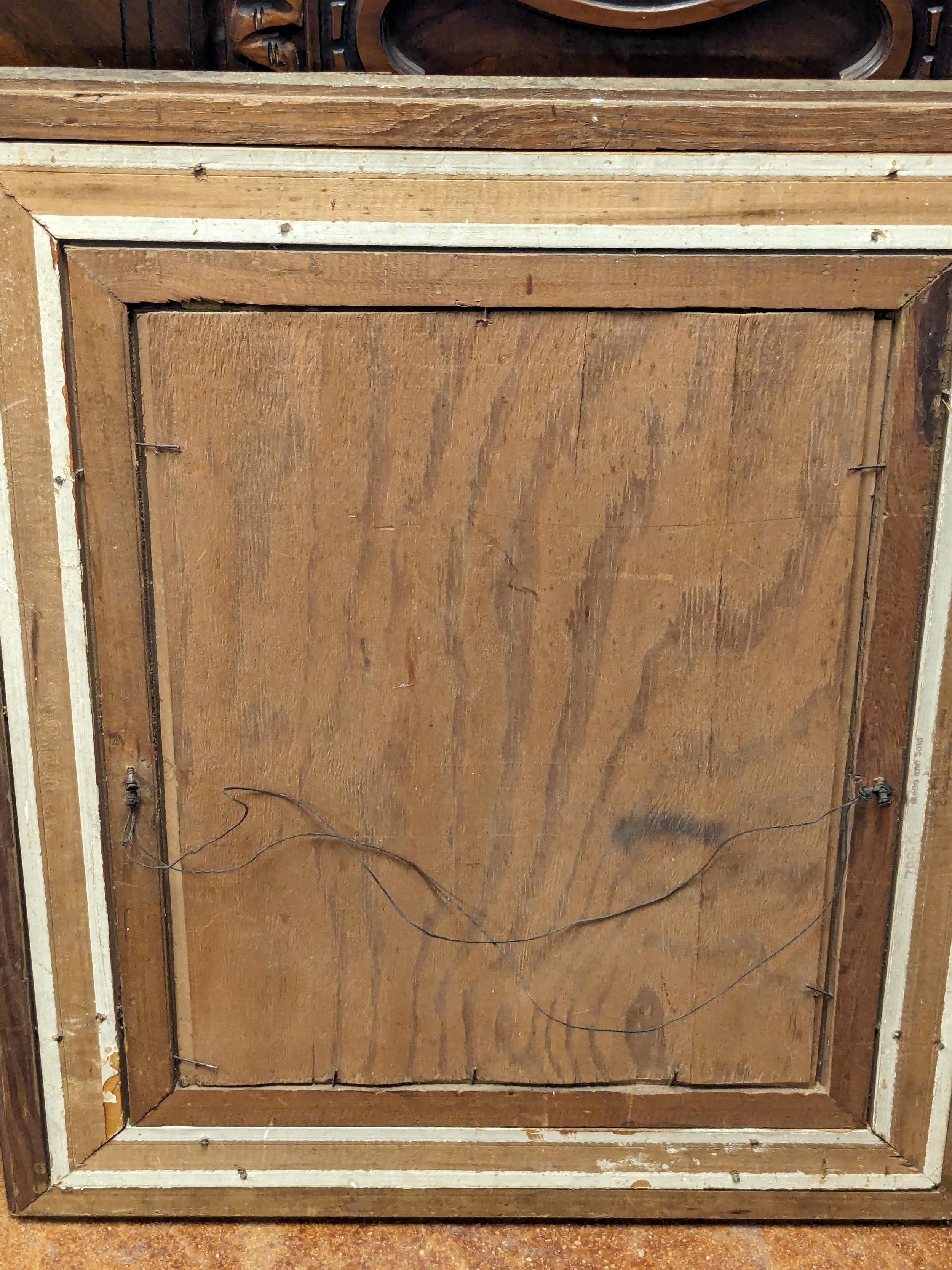
Getting back to the young girl in the portrait… we now know that her portrait process was likely a version of the Crayon Enlargement. She likely sat for a photographer who captured her image, which was then sent off to a studio that developed the portrait. From there, her photo print was enlarged and re-created onto paper by the artist, who likely used a combination of charcoal/ink, pastel, and possibly other paint or ink ‘tints’ to create some of the more subtle colors. Unfortunately we don’t know her name or where she lived, or anything about her family. But we do know some more details on her portrait process and how she and her family got to this point. From here we get to our second exploration into how her portrait was created— how her portrait even came to be, the ornate frame, and the Chicago Portrait Company.
The Chicago Portrait Company’s years were from 1893-1940s. They allegedly took part in some ‘schemes’ to sell portraits that offered the ‘best pricing at the time,’ yet they were really charging for their very expensive frames while claiming the pricing was for the specialty of having portraits done through them. The Chicago Portrait Company sent door-to-door salesmen to many parts of the USA, predominantly rural areas. They were bringing the ‘cultural innovations’ at theoretically better prices (which were still expensive for many consumers) to rural homes. Things they’ve been accused of are:
claiming the photo prints would be sent back to the Chicago studio for a reference guide so that an artist could completely hand-paint the portraits from the start (omitting the fact that the portraits really would be done via Crayon Enlargement)
telling customers the specialty frames would be fully gilded, while in reality the frames had only a tiny electroplated layer of 14k gold
claiming their prices were better than competitors at that time, due to their specialty and ‘most innovated’ processes that differed than competitors (*we have been able to track down a copy of a court document from the 1920s online that brought a cease and desist to court against them for this particular set of claims)
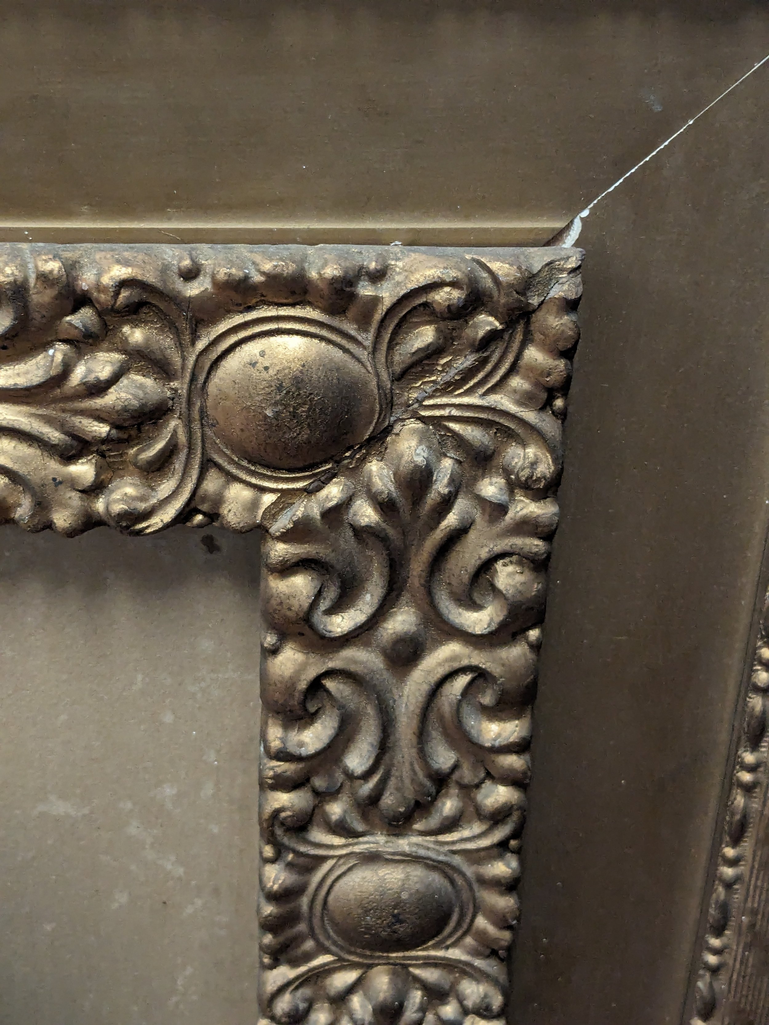
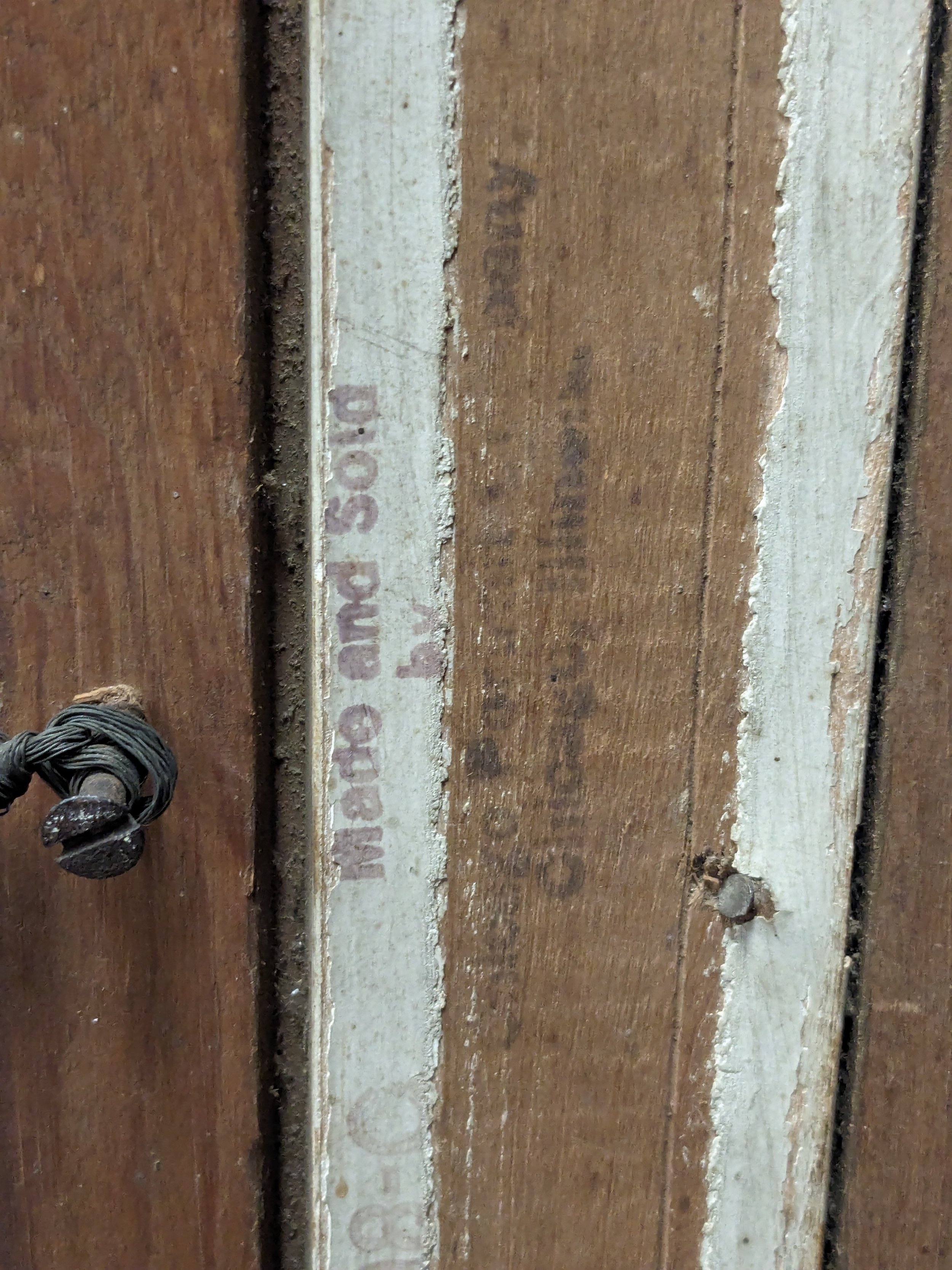
Whether some predatory salesmen went rogue at some point in time and told customers these false details to drum up sales and competition, or these were company-wide policies, we do not know the entire extent. However what we DO know is that Crayon Enlargements and similar methods were legitimate ‘artistic portrait’ processes of the time and were used by many singular photographer-artists as well as full-blown companies, and the ornate craftsmanship of the frame of this particular portrait is gorgeously executed. We don’t let any alleged misdeeds of the Chicago Portrait Company tarnish this young girl’s portrait, which we assume was cherished by her family for some time. How it came to be let go, we can only assume the typical passing of time and generational lines ending are to blame.
We hope you enjoyed our first installment of “Vintage Collectors’ Club” and hope to bring you more details behind some of our most interesting finds soon! In the meantime, if you’ve connected with this story and this portrait of the young girl, it’s currently available to purchase in-store only at our Shop & Studio location! You can purchase it online for in-store pickup, or visit us at Silk and Sage in Austin, Texas!

Discover 'Carte Blanche' Collection Paints + Wallpapers by Christopher John Rogers x Farrow and Ball
Meet the gorgeous capsule collection of 12 new paint colors and 3 new wallpaper patterns, by renowned designer Christopher John Rogers x Farrow and Ball.

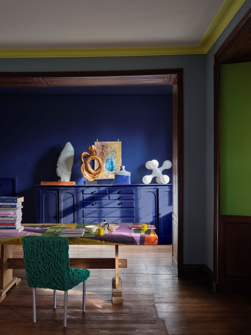
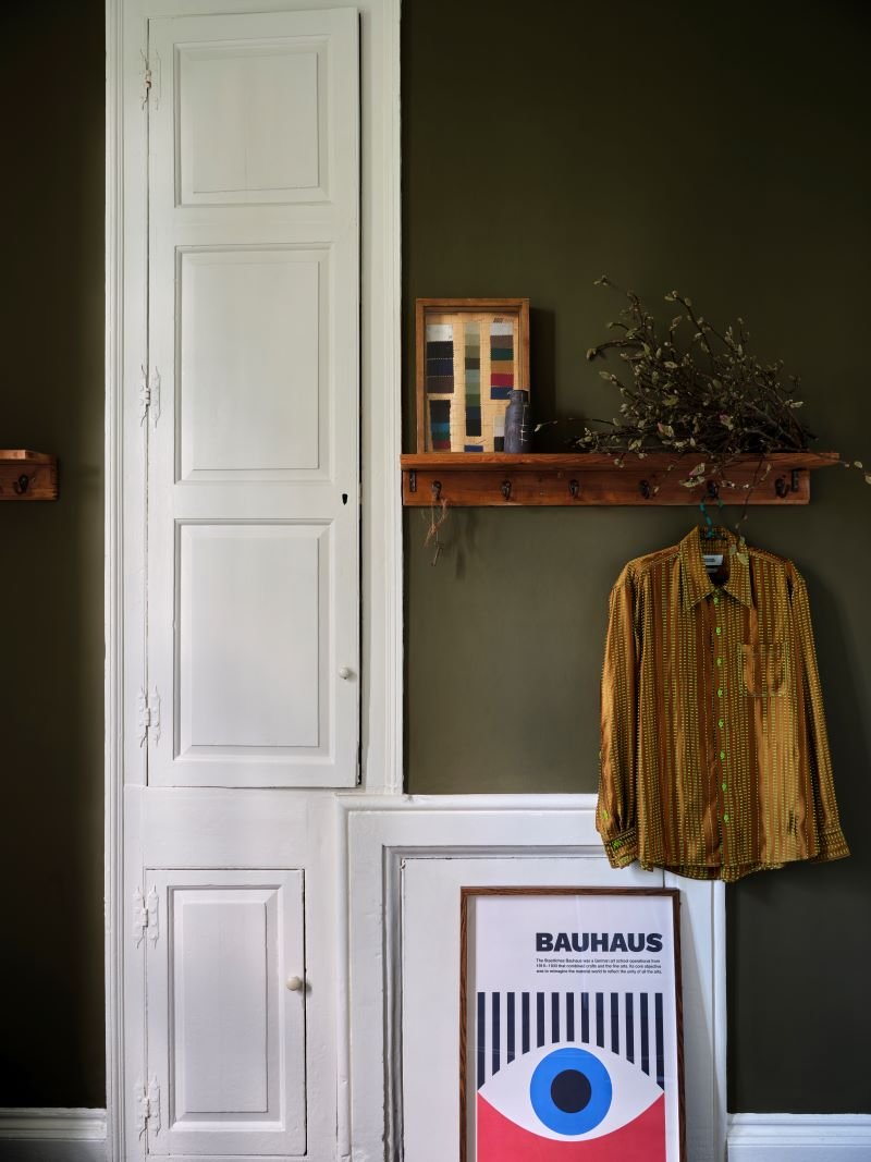
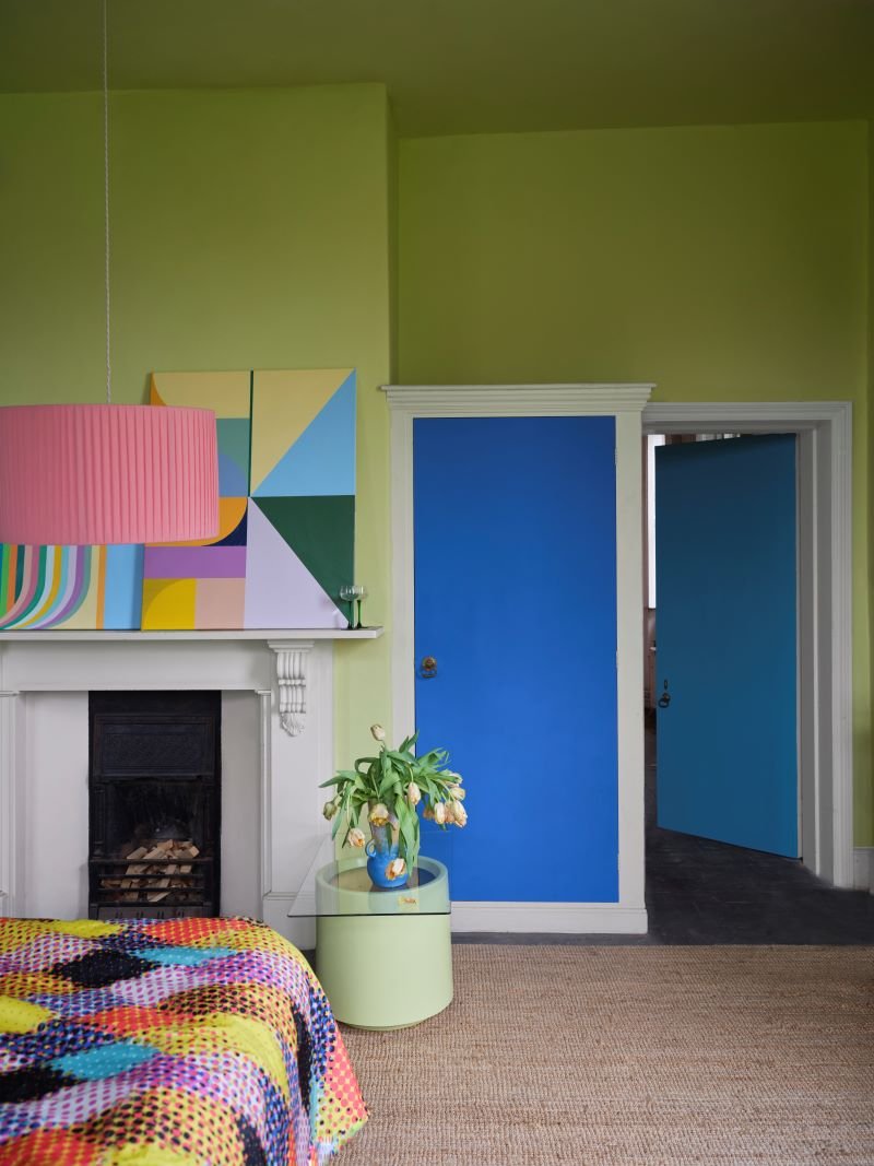
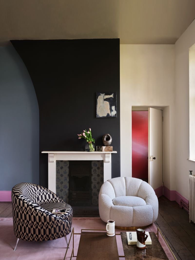
‘Carte Blanche’ is a stunning capsule collection of colors and wallpapers, as a collaboration between amazing designer Christopher John Rogers and Farrow & Ball. We’re feeling refreshed and grounded with these 12 new colors and 3 wallpaper patterns, and are SO excited to share them with you!
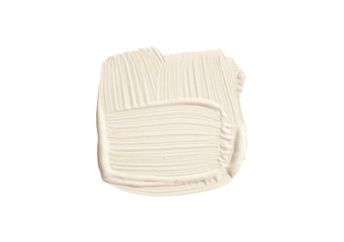
Au Lait: a soft white that is inspired by the chicory coffee popular in New Orleans, often served with steamed milk.
Blue Maize: a deep blue inspired by the unique hue of corn popular in Mexico and the Southern States.
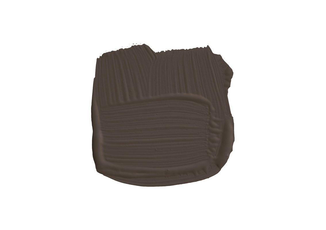
Cardamom: a rich brown inspired by the warming, versatile spice used in dishes around the world.
Hog Plum: a pale but intense yellow reminiscent of the sweet and sour fruit found across Central America and the Southern States.
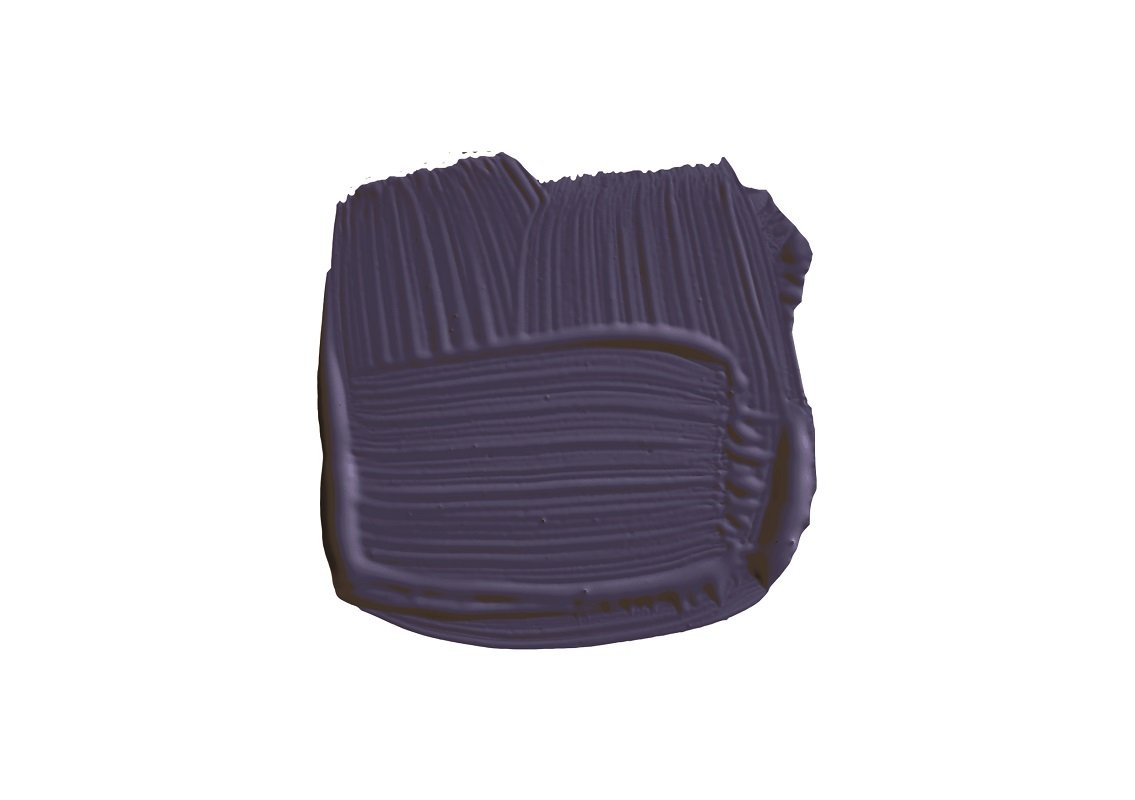
Liquorice: a warm, rich deep black is that of the classic sweet created using the root of the plant from which it takes its name.
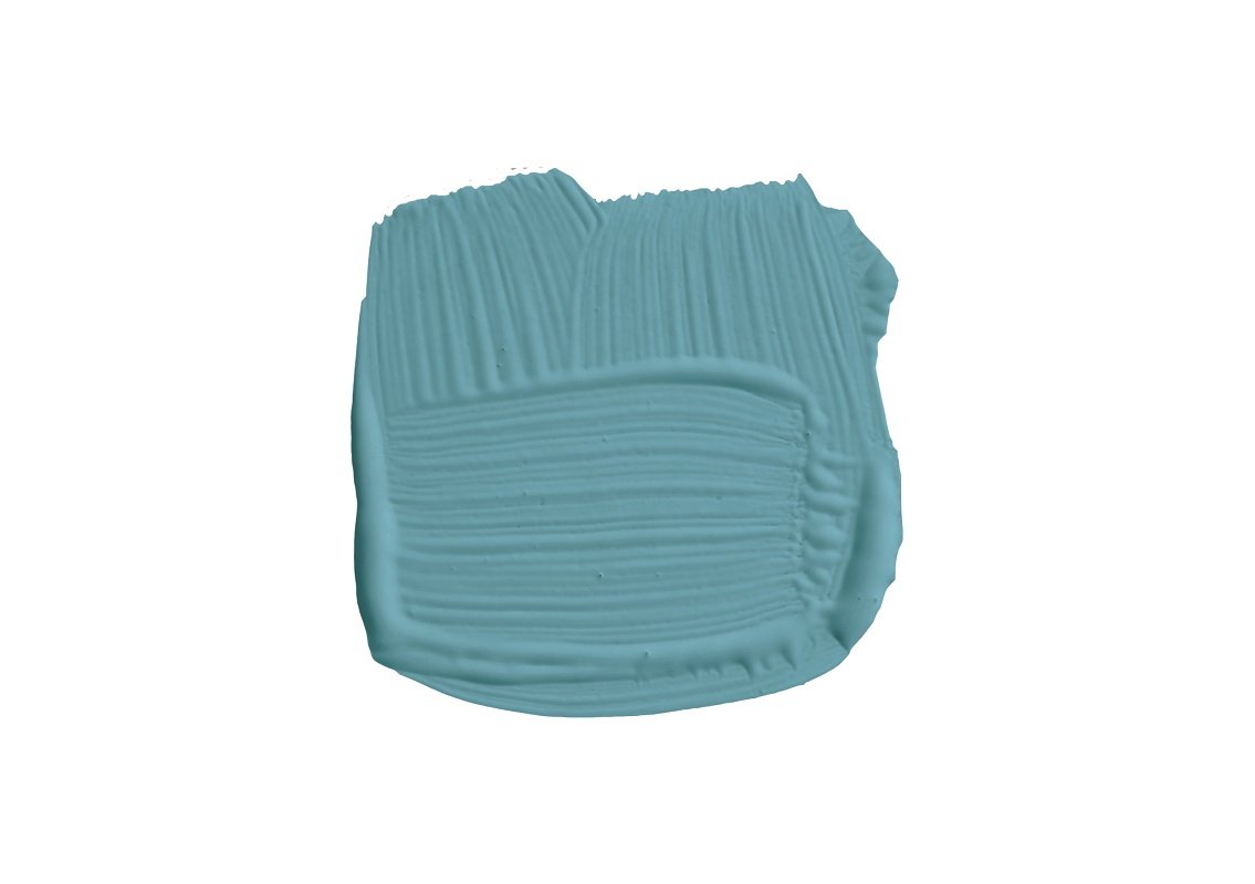
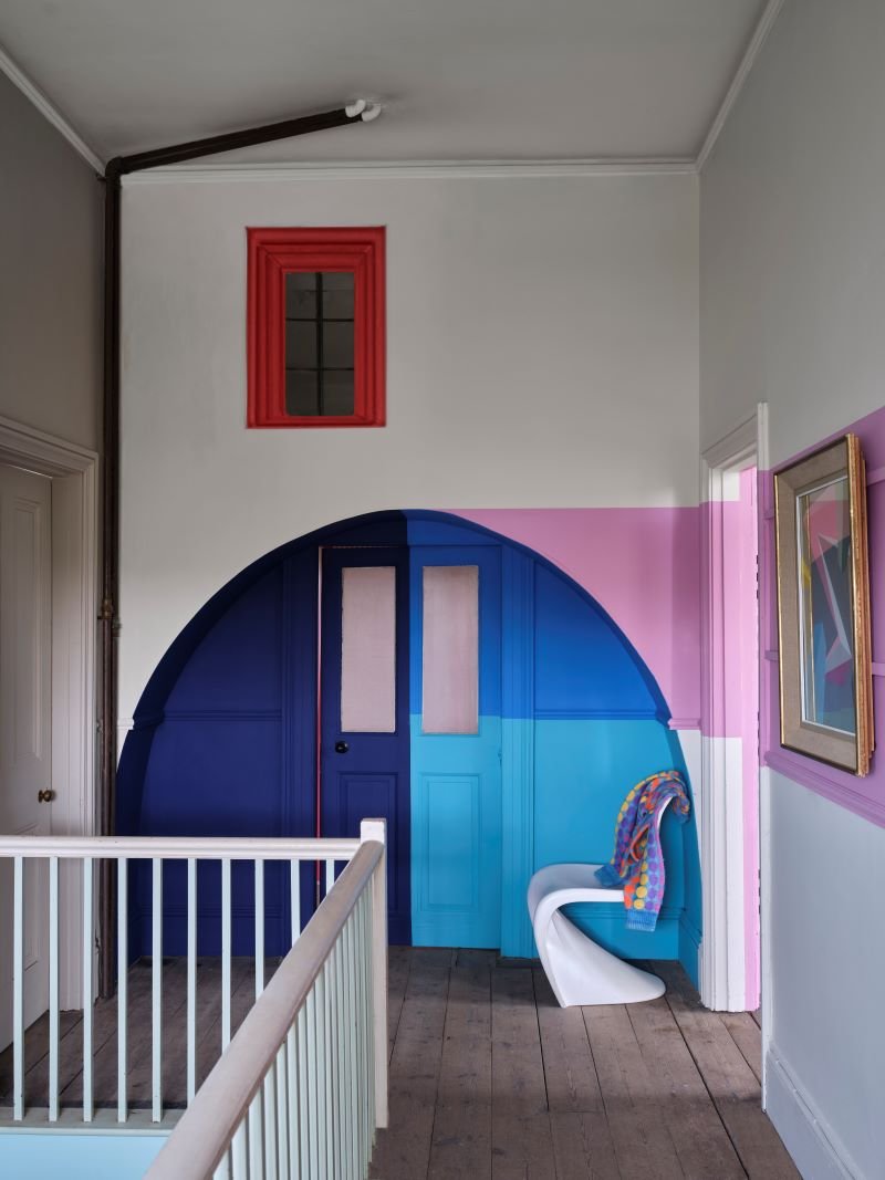
Lobster: a vibrant, lively blue that takes its name from the popular Louisiana catch.
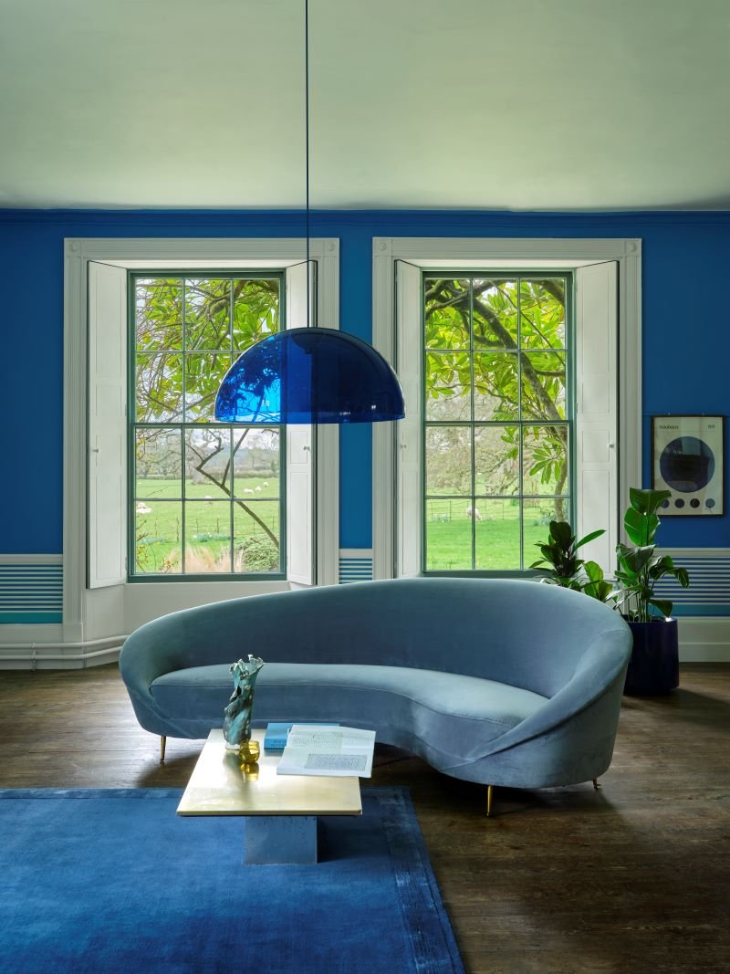
Pea Flower Tea: a vivid true blue, this shade is named after the brightly coloured drink created by infusing petals from butterfly pea flowers.
Raw Tomatillo: a joyful and verdant green inspired by the fried green tomatoes made by a beloved grandmother.
Roasted Macadamia: a warm, stony neutral that’s a favorite among The Squirrels, this soft neutral is named after the nut of a similar shade.
Romesco: a rich, brilliant red evocative of the classic Spanish sauce, which also doubles as a favourite makeup shade.
Sardine: a silver blue that takes its name from a favourite afternoon snack of a much loved grandfather.
Shallot: a cheerful pink that takes its name from a sweeter member of the allium family widely used in Cajun cuisine.

Christopher John Rogers is a renowned designer that’s famous for his rainbow-hued clothing. “Born and raised in Louisiana, Christopher was enamored by art from a young age, finding inspiration in everything from Ellsworth Kelly to the costumes of comic book characters and even airport décor. Exploring the space between pragmatism and glamour, his designs emphasize quality, timelessness and declaring your sense of self.”
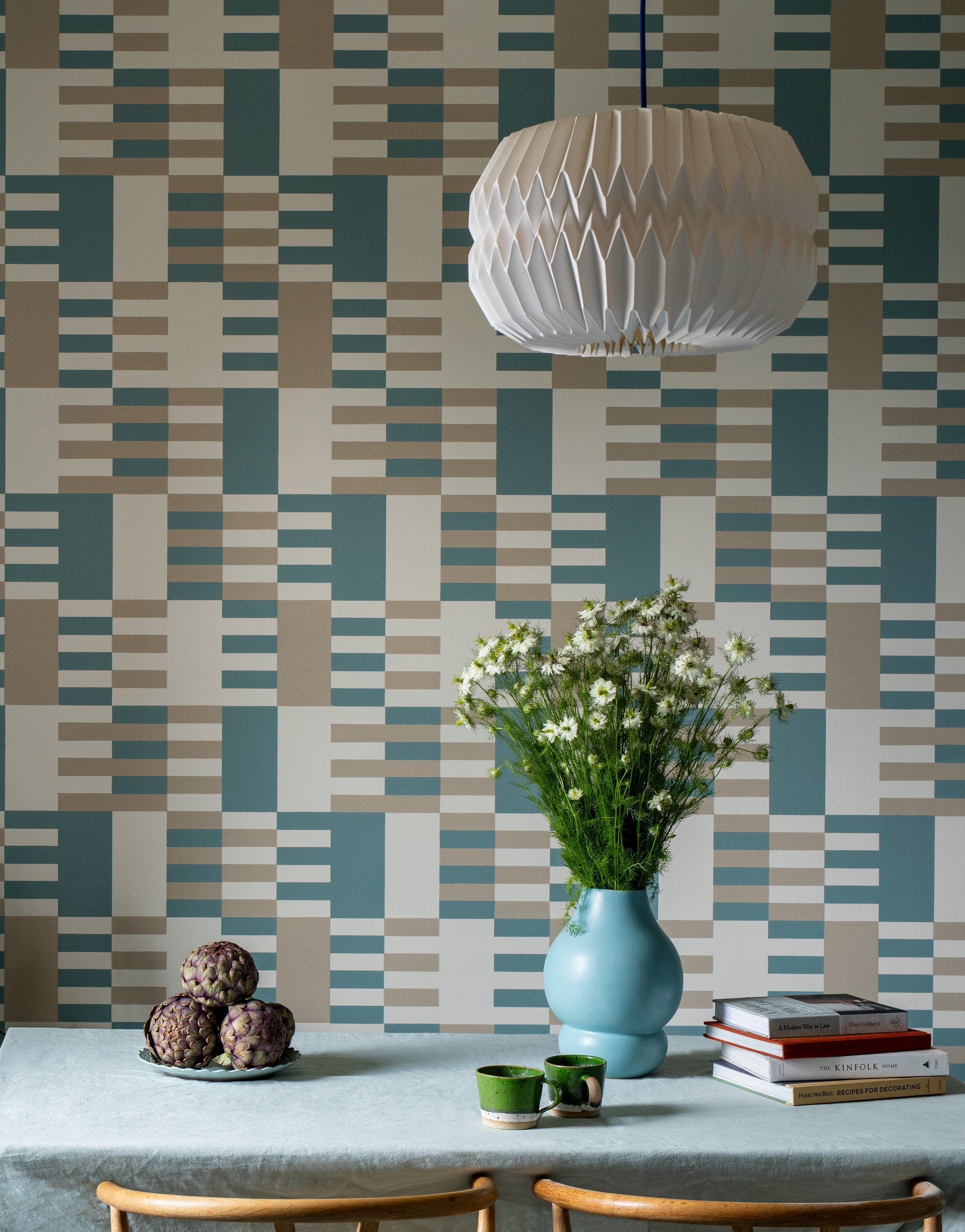
Check (wallpaper pattern): bold, Bauhaus-inspired Check pays homage to the innovative work of Anni Albers, the celebrated textiles artist— the geometric, mixed scale design feels both contemporary and classic, transforming your walls into a true work of art.
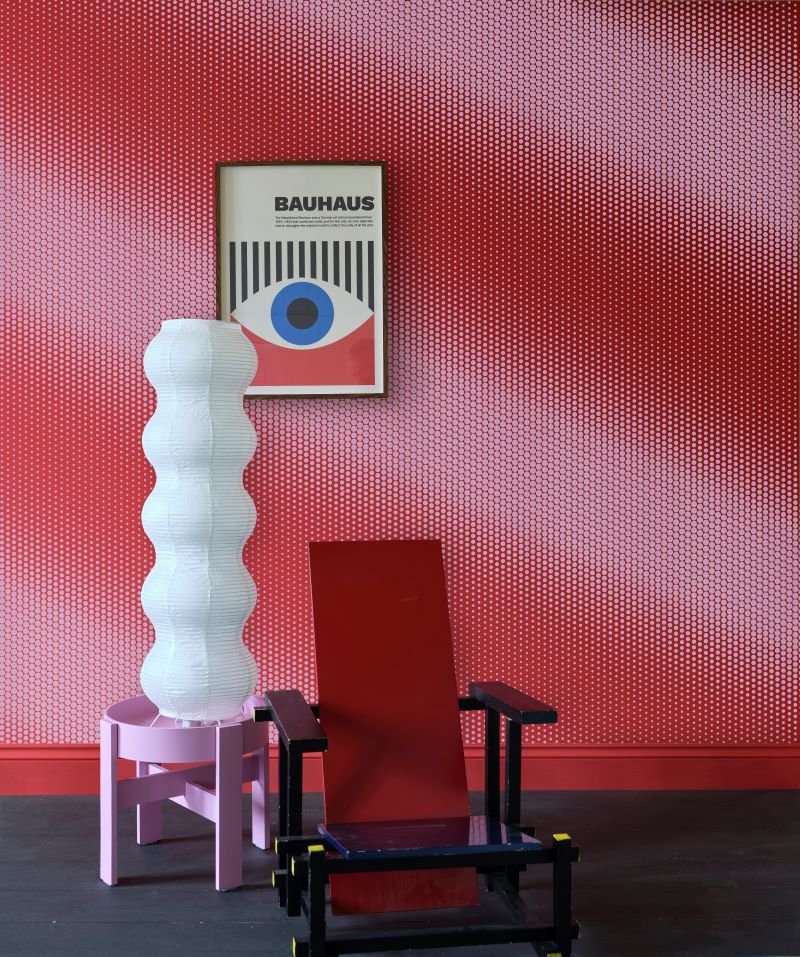
Dot (wallpaper pattern): this playful pattern celebrates one of Christopher John Rogers’ iconic designs— Graphic, graduated Dot brings energy and joy to your space, while the traditional flatbed printing method creates unique texture and tantalising depth.
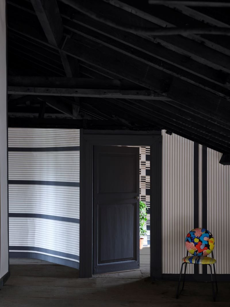
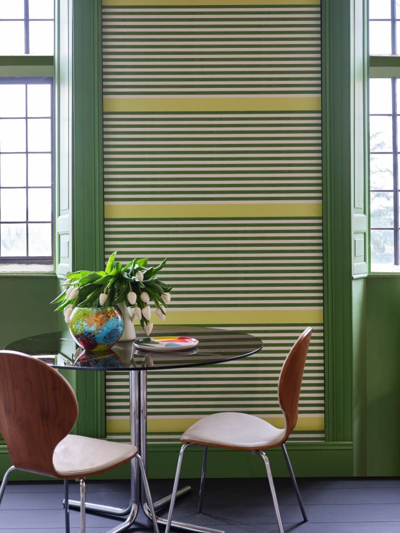
Stripe (wallpaper pattern): a fresh take on a true classic, Stripe brings added interest to one of our most enduringly popular designs— with a wide, statement stripe, this pattern is effortlessly versatile and can be hung in four different ways to create the look you love (and can be hung both ways for either vertical or horizontal looks).
Visit us to learn more about this fabulous collection, and to sample and shop paint and wallpaper patterns! Please note that samples for all Carte Blanche colors are available only in large single-sheet swatches to purchase (no sample pots). All paint colors are available in most Farrow & Ball finishes (*exceptions currently are Exterior Eggshell + Masonry, however Full Gloss is available for any exterior notes).

Our Visit + Conversation with Farrow and Ball!
Read Farrow & Ball’s writeup about their visit and conversation with us…

So Farrow & Ball paid us a visit in May this year, and we had a lovely conversation with them about using paint and color, and working with sustainable products. We had a blast and are thrilled to share their writeup about it all!


11 New Colors from Farrow & Ball!

The end of September introduces not only a new season… we’re also welcoming 11 new paint colors by Farrow & Ball! Perfect Autumn timing for some colorful excitement.
STIRABOUT
Stirabout is inspired by the nurturing porridge favored over many centuries in Ireland. An earthy tone with just a hint of underlying grey, it’s perfect for creating a relaxed feel, which will never be too cold. Try pairing it with Jitney and natural fabrics for a laid-back look.
Recommended Primer & Undercoat: White & Light Tones
EDDY

A gentle green named after the circular currents enjoyed by wild water swimmers as a natural jacuzzi. This evocative color creates a seamless connection with nature, perfect for use in a garden room or alongside natural materials. A breath of fresh air, Eddy is also an ideal choice for calm, relaxing spaces. It is delicate in tone without crossing into pastel and sits at the lightest end of the French Gray and Treron family.
Recommended Primer & Undercoat: White & Light Tones
TAILOR TACK

The lightest and most delicate of our pinks, this charming color is that of the tacking thread used in Haute Couture ateliers. It may be delicate but it’s strong in character and has enough color contrast with white. Perfect paired with vintage finds or industrial accents, this shade works well in both traditional and modern schemes.
Recommended Primer & Undercoat: White & Light Tones
TEMPLETON PINK

A historic-feeling pink, this shade was developed for the dining room at Templeton House to offset the magnificent Wedgwood plaques made to commemorate the former owner, although it suits a contemporary setting just as well. A more intense version of Setting Plaster or Pink Ground, it creates a warm, welcoming space, particularly in low light where this shade becomes surprisingly deep.
Recommended Primer & Undercoat: Mid Tones
BAMBOOZLE

Our most spirited red, the name of this fiery hue was originally used to describe the deceit of pirates. Full of buccaneering spirit, Bamboozle brings joy and warmth to any room scheme and is easy to use in both traditional and modern homes. It will hold its own in any light and pairs brilliantly with other strong colors, like Beverly and Wine Dark.
Recommended Primer & Undercoat: Red & Warm Tones
HOPPER HEAD

Sitting between the ever-popular Railings and Down Pipe, this classic charcoal color is inspired by the attractively designed iron containers used to catch rainwater at the top of a downpipe. Ideal for creating inviting spaces, Hopper Head works beautifully with nearly any Farrow & Ball shade or can be used exclusively across walls, woodwork and the ceiling for a dramatic space.
Recommended Primer & Undercoat: Dark Tones
SELVEDGE

A lighter, less grey version of popular De Nimes, Selvedge is named after the highly prized denim woven on a shuttle loom to produce closed edges. It’s particularly good in low-light spaces, creating a familiar and friendly atmosphere, making it suited to bedrooms or rooms you spend time in, in the evening. It pairs beautifully with accents of darker colors like Inchyra Blue or Hopper Head.
Recommended Primer & Undercoat: Mid Tones
KITTIWAKE

This clean cool blue is inspired by the wings of seabirds when seen in bright sunlight. Sitting between Parma Gray and Lulworth Blue, Kittiwake has a touch more black pigment creating a warmer, more relaxed feel. This shade is perfect for living spaces, staying truly blue in all lights. It also complements stainless steel especially well, so is ideal for contemporary kitchens. A sophisticated blue, it looks fantastic with Wine Dark and Borrowed Light.
Recommended Primer & Undercoat: White & Light Tones
WINE DARK

Inspired by midnight skies, this spiritual color is named after the term Homer used to describe the sea. Our richest blue, it’s the perfect addition to our strong blue family, being more sophisticated than Stiffkey Blue and more upbeat than Hague Blue. In low-light, Wine Dark becomes even richer, making it particularly glamorous in candlelight and perfect for creating intimate spaces.
Recommended Primer & Undercoat: Dark Tones
WHIRLYBIRD
For an upbeat space, try this lively green. A lighter version of Breakfast Room Green, Whirlybird is inspired by the papery winged seeds beloved by many playful young gardeners and nature lovers. It looks particularly lively in morning light and is complemented by Beverly and James White.
Recommended Primer & Undercoat: Mid Tones
BEVERLY

This clean mid green is named in honor of a kind and generous member of our Farrow & Ball team who is sadly no longer with us. A dependable, uncomplicated color, with the ability to feel even greener in bright daylight or more conservative in lower light. This shade is a beautiful addition to any home.
Recommended Primer & Undercoat: Dark Tones
A couple new things with the paint launch to keep in mind:
11 colors are now archived! View the following now located in the Archive Collection (we can still make them though)- Savage Ground #213, Salon Drab #290, Radicchio #96, Blazer #212, Pale Hound #71, House White #2012, Churlish Green #251, Pavilion Blue #252, St Giles Blue #280, Pitch Blue #220, Mahogany #36
Some of these 11 new colors are not available in all finishes yet. Please wait until early 2023 for the following to be available-
Full Gloss finish in Hopper Head, Bamboozle, Wine Dark, Beverly
Exterior Eggshell in Hopper Head, Wine Dark, Beverly
Exterior Masonry in Kittiwake, Templeton Pink, Selvedge, Whirlybird, Hopper Head, Bamboozle, Wine Dark, Beverly

All items are available at our Shop & Studio to purchase, including sample pots (which come in the Estate Emulsion 2% sheen/ flat finish)! Don’t forget your complimentary copy of a new foldout color card. View our Primer Guide for proper application advice on all projects. Visit us soon to see all the new, colorful additions!
What to Choose for Your Next Project- Annie Sloan Paints

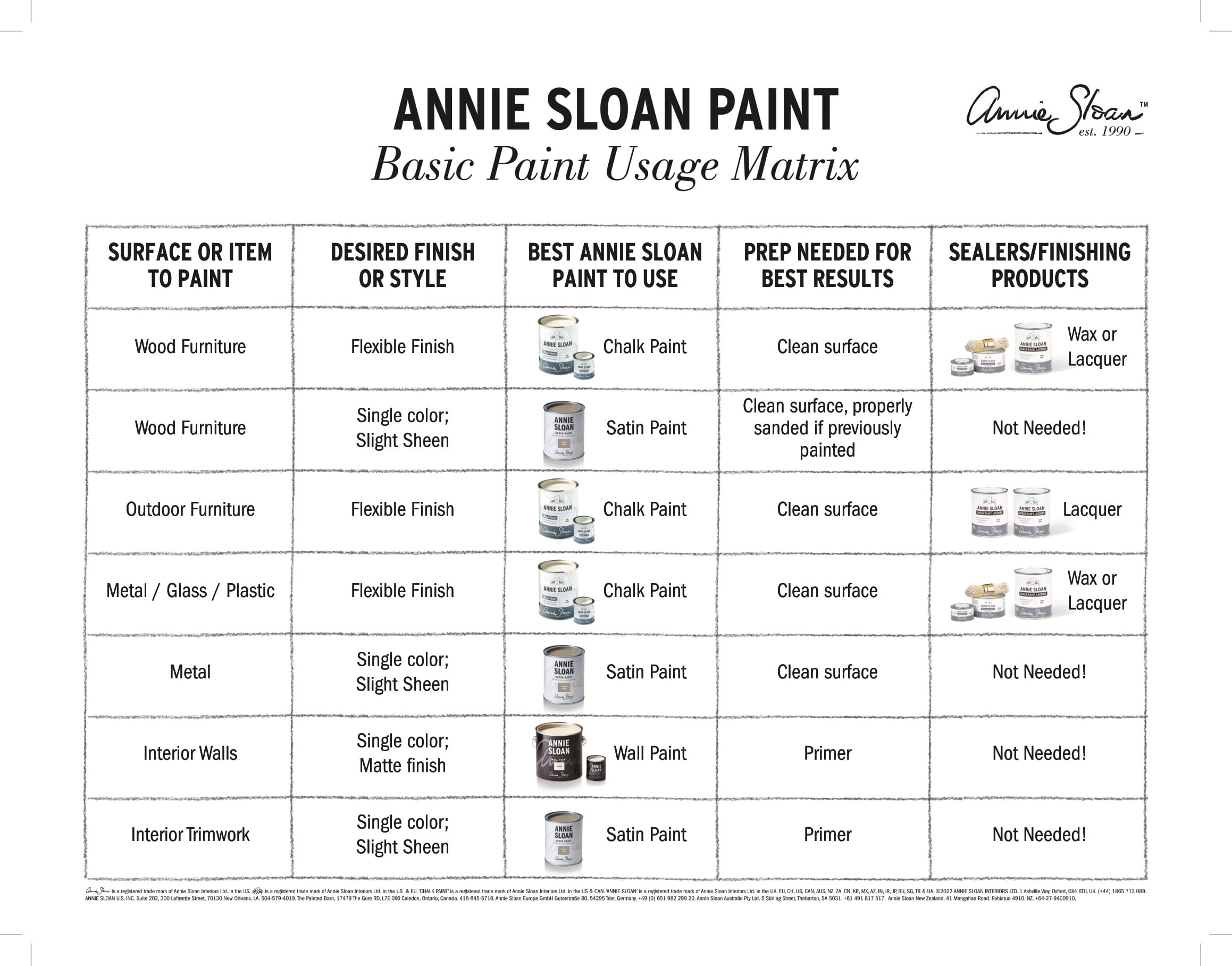
Today we’re sharing a short but informative compilation of how to choose the best Annie Sloan paint for your next project! If you haven’t heard yet, Annie Sloan’s new Satin Paint and Wall Paint have finally reached us in the US, and we are fully stocked. We absolutely love these new additions as they create a full ‘story’ for your spaces when combined together with Chalk Paint®.
Now, how are they different from the original Chalk Paint® and how do you know which is best to use for your projects? Firstly, while there are some colors repeated throughout all three paint lines, there are some only featured in the new collections or are even exclusive to the new collections (yes there are some gorgeous new colors NOT seen with Chalk Paint® before!). But as for choosing based on what your surface type is, where it’s located, and what your final look wants to be, see our lovely simplified chart below:

For square footage coverage:
Chalk Paint® covers 150 SF per tin per coat
Satin Paint covers 118.4 SF per tin per coat
Wall Paint covers 387 SF per gallon per coat
Aaaannd, that’s it! Stay tuned for more projects and blog posts featuring these great new paint additions. In the meantime visit us at our Shop & Studio to see samples in-person and to shop all things paint (you can shop online with us too of course, but it’s more fun to see your faces).
