11 New Colors from Farrow & Ball!

The end of September introduces not only a new season… we’re also welcoming 11 new paint colors by Farrow & Ball! Perfect Autumn timing for some colorful excitement.
STIRABOUT
Stirabout is inspired by the nurturing porridge favored over many centuries in Ireland. An earthy tone with just a hint of underlying grey, it’s perfect for creating a relaxed feel, which will never be too cold. Try pairing it with Jitney and natural fabrics for a laid-back look.
Recommended Primer & Undercoat: White & Light Tones
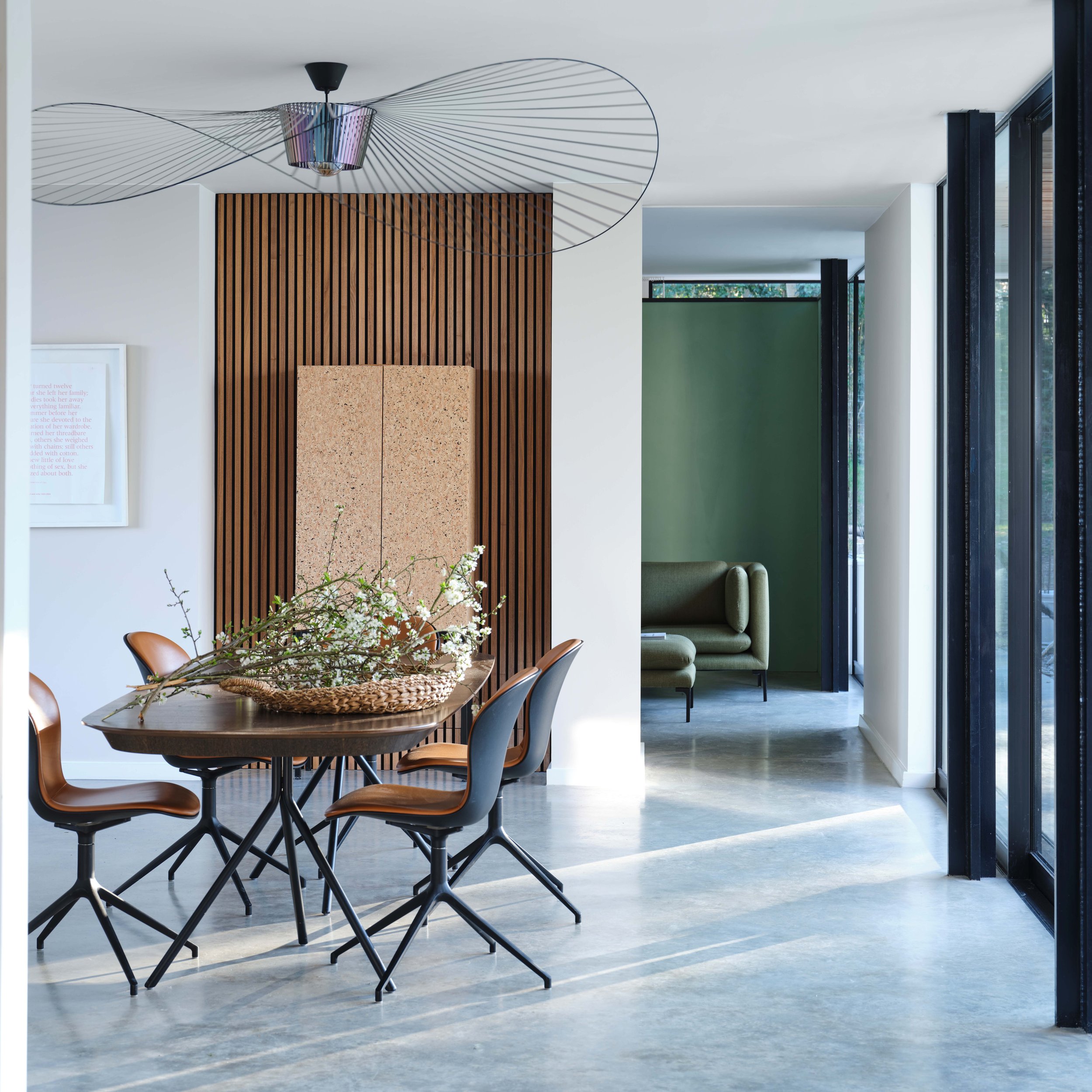
EDDY

A gentle green named after the circular currents enjoyed by wild water swimmers as a natural jacuzzi. This evocative color creates a seamless connection with nature, perfect for use in a garden room or alongside natural materials. A breath of fresh air, Eddy is also an ideal choice for calm, relaxing spaces. It is delicate in tone without crossing into pastel and sits at the lightest end of the French Gray and Treron family.
Recommended Primer & Undercoat: White & Light Tones
TAILOR TACK

The lightest and most delicate of our pinks, this charming color is that of the tacking thread used in Haute Couture ateliers. It may be delicate but it’s strong in character and has enough color contrast with white. Perfect paired with vintage finds or industrial accents, this shade works well in both traditional and modern schemes.
Recommended Primer & Undercoat: White & Light Tones
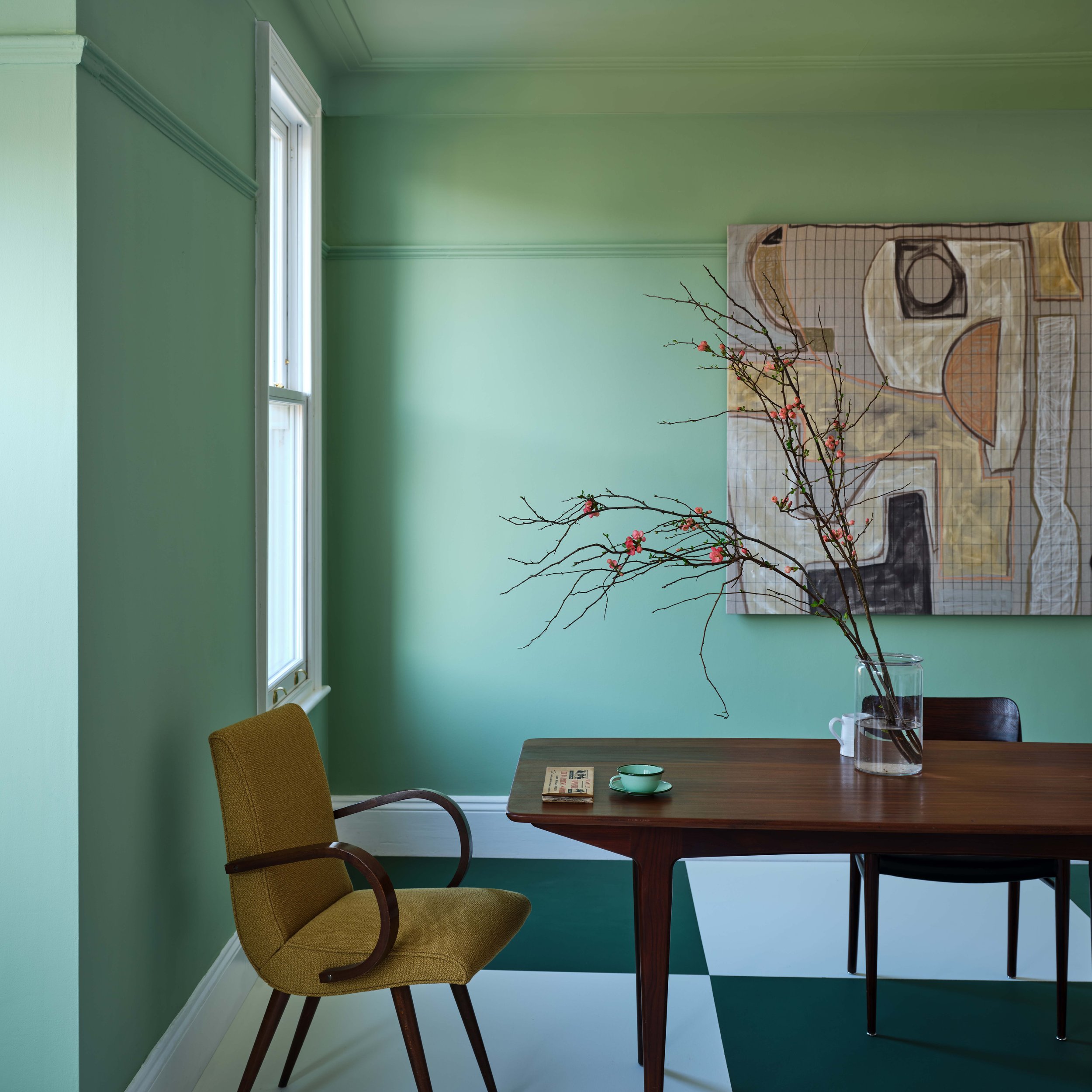
TEMPLETON PINK

A historic-feeling pink, this shade was developed for the dining room at Templeton House to offset the magnificent Wedgwood plaques made to commemorate the former owner, although it suits a contemporary setting just as well. A more intense version of Setting Plaster or Pink Ground, it creates a warm, welcoming space, particularly in low light where this shade becomes surprisingly deep.
Recommended Primer & Undercoat: Mid Tones
BAMBOOZLE

Our most spirited red, the name of this fiery hue was originally used to describe the deceit of pirates. Full of buccaneering spirit, Bamboozle brings joy and warmth to any room scheme and is easy to use in both traditional and modern homes. It will hold its own in any light and pairs brilliantly with other strong colors, like Beverly and Wine Dark.
Recommended Primer & Undercoat: Red & Warm Tones
HOPPER HEAD

Sitting between the ever-popular Railings and Down Pipe, this classic charcoal color is inspired by the attractively designed iron containers used to catch rainwater at the top of a downpipe. Ideal for creating inviting spaces, Hopper Head works beautifully with nearly any Farrow & Ball shade or can be used exclusively across walls, woodwork and the ceiling for a dramatic space.
Recommended Primer & Undercoat: Dark Tones
SELVEDGE

A lighter, less grey version of popular De Nimes, Selvedge is named after the highly prized denim woven on a shuttle loom to produce closed edges. It’s particularly good in low-light spaces, creating a familiar and friendly atmosphere, making it suited to bedrooms or rooms you spend time in, in the evening. It pairs beautifully with accents of darker colors like Inchyra Blue or Hopper Head.
Recommended Primer & Undercoat: Mid Tones
KITTIWAKE

This clean cool blue is inspired by the wings of seabirds when seen in bright sunlight. Sitting between Parma Gray and Lulworth Blue, Kittiwake has a touch more black pigment creating a warmer, more relaxed feel. This shade is perfect for living spaces, staying truly blue in all lights. It also complements stainless steel especially well, so is ideal for contemporary kitchens. A sophisticated blue, it looks fantastic with Wine Dark and Borrowed Light.
Recommended Primer & Undercoat: White & Light Tones
WINE DARK

Inspired by midnight skies, this spiritual color is named after the term Homer used to describe the sea. Our richest blue, it’s the perfect addition to our strong blue family, being more sophisticated than Stiffkey Blue and more upbeat than Hague Blue. In low-light, Wine Dark becomes even richer, making it particularly glamorous in candlelight and perfect for creating intimate spaces.
Recommended Primer & Undercoat: Dark Tones
WHIRLYBIRD
For an upbeat space, try this lively green. A lighter version of Breakfast Room Green, Whirlybird is inspired by the papery winged seeds beloved by many playful young gardeners and nature lovers. It looks particularly lively in morning light and is complemented by Beverly and James White.
Recommended Primer & Undercoat: Mid Tones
BEVERLY

This clean mid green is named in honor of a kind and generous member of our Farrow & Ball team who is sadly no longer with us. A dependable, uncomplicated color, with the ability to feel even greener in bright daylight or more conservative in lower light. This shade is a beautiful addition to any home.
Recommended Primer & Undercoat: Dark Tones
A couple new things with the paint launch to keep in mind:
11 colors are now archived! View the following now located in the Archive Collection (we can still make them though)- Savage Ground #213, Salon Drab #290, Radicchio #96, Blazer #212, Pale Hound #71, House White #2012, Churlish Green #251, Pavilion Blue #252, St Giles Blue #280, Pitch Blue #220, Mahogany #36
Some of these 11 new colors are not available in all finishes yet. Please wait until early 2023 for the following to be available-
Full Gloss finish in Hopper Head, Bamboozle, Wine Dark, Beverly
Exterior Eggshell in Hopper Head, Wine Dark, Beverly
Exterior Masonry in Kittiwake, Templeton Pink, Selvedge, Whirlybird, Hopper Head, Bamboozle, Wine Dark, Beverly

All items are available at our Shop & Studio to purchase, including sample pots (which come in the Estate Emulsion 2% sheen/ flat finish)! Don’t forget your complimentary copy of a new foldout color card. View our Primer Guide for proper application advice on all projects. Visit us soon to see all the new, colorful additions!