
Transformative Checkout Counter
How we created our checkout counter with Chalk Paint® by Annie Sloan.
I'll start with the end result!
A LOT has happened in our land. We've opened up shop! And you know what the means... the shop is never complete without a central checkout point. We decided to create ours in style. I had seen a photo on Pinterest (go figure) a few months back that inspired this. All I had to do was find a roughed up cabinet and buy some faux metal ceiling tile, and voila.
I had to first start at the top and peel off all the nasty veneer that was cracking. It's not super difficult, but there is a process. To do this at home you just need a damp rag and an iron that can reach a high steam setting. First you place your damp rag over the peeling veneer, then you set the hot iron on top, rotating in sections for about 10-15 seconds each. This top was stubborn so I needed to go around for a second time, but essentially what happens is that the hot moisture loosens the glue and then you can peel off the veneer in strips with a scraper!
Once all the real dirty work was done, I cut my faux tin tile to size and affixed it into the inset areas of the cabinet. I made sure that for the central section, the designs matched from top to bottom.
I added some Antibes Chalk Paint® over select areas. This will make sense later by imitating a metallic patina.
Super hot-mess status! I added some Barcelona Orange in select areas as well, to mimic rust. But, every project has a moment like this where it looks really scary and feels like you messed it up. Not to worry, like I said, carry on because it will all make sense later.
Looking a little bit more put together. A layer of Graphite helped complete the look.
Now for the icing layer! I distressed with corse steel wool and sandpaper to bring up the under tones.
I applied clear wax over the whole cabinet first, mainly to prevent the top surface from being vulnerable. After all, it will get lots of traffic! Then I took some dark wax to the high and low tile areas to further patina the surface.
And there you have it! I did it over two days, to let the paint fully dry over the faux tin tile. Since that part was plastic, it was a bit slick to paint over (same goes with metal or glass). But if you let the paint fully dry between coats it'll stick just fine!
Come check it out in person at our studio at 2700 W. Anderson Ln, Suite 228, Austin!
Musings on Color
Our thoughts on using colors within your interior, and color theory.
Let me just say that I LOVE earth tones. The more beige, gold, and all earthy relatives, the better. But I know that there's this strange and interesting thing that happens with people... that we all develop our own preferences, some of them purely personal and some of them culturally motivated. Gee, who would have thought that we all associate colors with different things?! Sarcasm aside, it truly is interesting and I always love to hear why someone has their favorite color palette (if they have a reason for it).
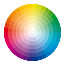
You probably remember learning about Primary colors, the color wheel, and ROYGBIV right? Some of us are immersed with this knowledge everyday because of our lines of work or out of pure enjoyment. It's easy to forget that there are actual Color Theories!
Take this color wheel for example. There are the basic names for color families, like reds and blues. We can simplify what a color is, yet there are so many tints-
tint /tint/
noun
1.
a shade or variety of color.
"the sky was taking on an apricot tint" (*as Google quotes)
Why do we not have more names for colors? Of course I know it depends on how our language developed and continues to, and in some cases we do have variation. Take the color Periwinkle for example. It's claimed as a blue, yet it does have its own name. Referring to it as blue is not wrong, nor is referring to it as Periwinkle. Some believe that Lavender and Periwinkle are synonymous, though they do have differences.


As you can see, both colors are somewhere in between purple and blue. But the main point here is that we all decide to group certain things together, and colors definitely fall under that category. The next level to examine then is color association. Why does one person perceive blue to be relaxing when another perceives it as cold? Again, personal feeling and emotion comes into play, but is often combined with cultural traditions. For example, some cultures maintain white as a color associated with mourning and do not use it in the home unless related to those purposes, while for others it is the hottest new minimal architecture and design trend.
Here is a small dissection of this by Apartment Therapy (do I love their photo-guided home and apartment tours!).
*photo credited to above article from Apartment Therapy, featured from their tour on Melinda & Mark's Creatively Curated Eagle Rock Home.
The bottom line I suppose is that we all like what we like. Sometimes that overlaps with trends and with what other people like. There are certainly classic color palettes for homes, offices, etc. for this reason. But we should also know when to embrace our preferences and break the mold! Part of why I am so passionate about my work, business, and enjoyment of DIY and furniture refinishing is that you can truly create your own dream. Let's all make that our motto for 2016 :).
Happy painting, designing, or whatever it is that you love to do.
xoxo

How to Stencil Properly
Stenciling 101 with Chalk Paint® by Annie Sloan.
Now you have probably used a stencil at least once in your life and are very familiar with how a stencil works. But what if I told you that using stencils on furniture, floors, and walls had a slightly different technique to it? It does, and is very easy to follow.
One of the main concerns with stenciling on furniture and interior spaces is 'bleeding'- that pesky act of paint seeping underneath the stencil lines and creating the opposite of clearly defined shapes. This can be a big bummer once you lift a stencil up. But I'll teach you how to escape this! The key to cutting bleedthrough under the stencil and to making your stenciled image not look harsh is to use less paint.
You'll Need:
- a stencil brush
- stencil of choice (preferably cut out of Mylar or another durable, thin plastic)
- a sprayable tacky adhesive
- paint
- paper towel
Stencil brushes, as you can see, come in different sizes. However they should always have a dense bunch of bristles that come to a flat, even surface across the top. This will provide even coverage of paint over your stencil.
Now why do we use stencils made of Mylar or similar thin plastic? Because they are durable, easy to clean, and will last years. They are more pricey but they're an investment, well worth it to not have your favorite stencil fall apart after a couple uses. Some of my favorites come from Royal Design Studio.
After you choose your stencil and paint (or paint combinations), spray the tacky adhesive to the back of the stencil. This will keep the stencil in place, super important! Lay the stencil across your flat surface. Dish out a small portion of your paint into a shallow container, you will only be using a tiny bit at a time. Make sure your stencil brush is completely dry, because the 'drybrush' technique is what prevents bleedthrough. Watch my quick video demo of how to properly stipple the paint over the stencil:
- Dip your brush head into the paint so that just the tips carry some paint.
- Offload a bunch into your paper towel by pushing down once or twice into it. This absorbs excess paint and keeps the bristles dry.
- Quickly stipple your paint over a small area of the stencil by rapidly pushing the brush head down flat over the surface.
- Reload paint onto the brush head, offload, and repeat as needed!
- Seal your painted surface with your normal sealant, such as wax, hemp oil, or tung oil.
Pretty simple right? The outcome will look 'powdery.' This is more aesthetically pleasing on furniture since the image is not harshly defined. On floors or walls you may want to apply with a foam roller depending on how much space you need to cover. Whenever using a roller you'll want to wet it a tiny bit so that the paint doesn't completely absorb into the roller (you'll use more paint). Check out our most recent project- to stencil a simple central image onto this set of bamboo serving trays. This is an example of how a stencil can transform and add depth to your home!
*As a closing note, most stencils have a repeat-pattern. This means there are special marks on the Mylar that guide you to overlap your stencil onto the image you just painted that help to keep your pattern straight, accurate, and able to repeat for however large a space you want your stencil to cover.
Happy Stenciling!

Inside the Tool Box: Brushes 101
A primer on what brushes are best to keep as your tools.
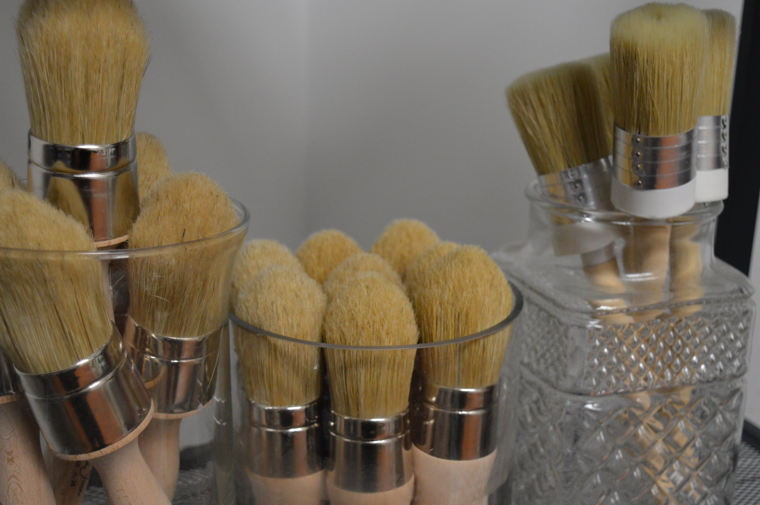
Getting to explore and learn how to properly use all the tools of your trade is pretty awesome. I have my favorite tools no doubt- and you should absolutely have your favorites too that make life easier. A huge component of refinishing furniture is an arsenal of great brushes. Not all brushes are created equal of course, so today I'm going to break down some options that you can regularly use. They're great to get your hands on as a beginner and can be saved through many projects.
The 'Disposable' Chip Brush
Good old Mr. Chip brush is often only branded as disposable but can certainly be saved if properly washed out and dried after use. A chip brush is a natural bristle brush with a short-medium handle and flat brush head. They are inexpensive, $2.00 each maximum at most stores (and you can usually buy packs of five or more). This makes them a quick and easy grab for a basic project. No worries if you are working with materials that make the brush unsalvageable, like with some shellac. Natural bristles can give some texture to your coats of paint, especially for rustic looks. I use mine for anything, from painting to applying oil for distressed techniques.
*Beware, most brushes shed, and natural brushes even more so. The cheapest of chip brushes can shed like no one's business!
The Synthetic Brush
Synthetic bristles are obviously not natural- many artists even prefer them simply because they are vegan (which is always great by the way). They're great for applying smooth undercoats/primer coats. The one I have pictured here is a short and angled brush by Wooster. I prefer it because the handle is made of flexible plastic for comfort, and the bristles are angled to reach into difficult areas. I prefer this brush for more tricky finishes- like with high gloss paints that need perfect application. However there are so many wonderful synthetic brushes on the market for you to discover. Most run in the $7-$15 range.
The Smooth Top Coat Brush
This kind of brush stands out because while it is made of natural bristle (or a blend of natural with some alternating synthetic), the bristles haven't been cut at the tip. This means the bristles shouldn't fray or shed out often. Mine is from Artisan Enhancements® and was formulated to apply their liquid soya-based alkyd sealer. However I also like it when I'm painting a smooth finish, especially with milk paints since this brush can absorb liquids in a controlled manner! High quality means the prices of these brushes will be $20-$40, which is an investment but will last years. This is my absolute preference over a purely synthetic bristle for a finish that feels like velvet.
The Wax Brush
If you are working with paints that are porous (like Chalk Paint® or any milk paints) then I'm sure you know you are supposed to wax your surface as the final finish. But how do you do this evenly? The key is the wax brush. Many people think that this is a step they can skip and just apply furniture wax with a rag, which is unfortunately a misconception. This route will mostly cause uneven application of wax on flat surfaces, and since rags absorb a lot of the wax you will waste much of your can and end up throwing the rags in the trash. The wax brush holds a fine amount of wax so you don't apply too much at once. Its dense bristles help to push the wax down deep into the pores of the paint, creating a wonderful, durable seal. And please note that wax brushes are easily cleaned with lye soap as it is a super degreaser. The wax brush is a necessary investment, costing between $15-$45, and will last forever if you care for it properly.
*I don't recommend soaking your wax brush in mineral spirits for long to clean, since the mineral spirits can eat away at the bristles and the glues holding them in place. I only recommend a slight swish of mineral spirits if wax has hardened on the brush and you need to bring it back to life!
An artist can have great talent and skill, but if he or she doesn't have a good selection of tools then frustration and re-dos can be in the mix. Some of these are necessary, some of these are merely preference. But regardless, building your arsenal is crucial to practicing all the techniques you desire. Now go ahead and acquire your own favorite painting tools to work with!
Benjamin Moore Announces its 'Color of the Year'
Color of the Year, selected by Benjamin Moore.
Benjamin Moore just announced its Color of the Year and all I can say is that white is definitely 'it' in design for 2015, and will probably be very hot in 2016 as well.
(image credited from the linked article above, Benjamin Moore 'Color of the Year')
We can't wait to see what Pantone officially announces as the 2016 Color of The Year. Currently in their Color Trends report, they are valuing colors that 'transcend cultural and gender norms.' Here at Silk and Sage Design we are all for that and for appreciating color theory in new ways. 2016 will certainly be the year for transcending many social hurdles.
As for now we are still under the influence of Marsala, the official 2015 COTY. What a beautiful and luscious tone for Autumn. It evokes changing leaves, cinnamon, wine, and earthy warmth.
(image credited from Pinterest, from myoldcountryhouse.com)
How gorgeous? Its ripples have been felt from design, through fashion, through cuisine. A close and accessible match to Pantone's Marsala is in fact Annie Sloan's Burgundy. We know we'll continue to appreciate this color as classic even as 2015 draws to an end.