
Annie Sloan's Black & White Wax Week
Join us in celebrating Chalk Paint® Wax Week by Annie Sloan! In-store events and demos to follow!
Starting Tuesday July 19th (we're closed on Mondays!), we'll have in-store demos between 1-3 PM for the new Chalk Paint® Black and White Waxes! Stop by for some fun- we'll have snacks and refreshments.
**On Thursday July 21st, we'll have a special adult-friendly waxing demo session from 5-7 PM featuring WINE AND CHEESE! Bring your questions about your next project(s), and bring your friends!**
Guest Blog Post- Sharon's Crackled Dining Table
Guest Blog Post by Sharon Munroe- how she transformed her dining table with Chalk Paint® and Soft Waxes, plus Crackle Tex by Artisan Enhancements®
Our friends and customers have been exploring different techniques over an array of projects. Recently we had one such experience shared with us by Sharon Munroe, who writes below about the transformation of her pine dining table with Chalk Paint® by Annie Sloan and Crackle Tex by Artisan Enhancements®. We're excited to share her guest blog post today!

Guest Blog by Sharon Munroe
On the last Sunday in June, my friend Morgan and I had a great experience learning new painting techniques with Katie, an artist and co-owner of Silk and Sage Design Studio, which opened in the Village Shopping Center this past spring. A painter myself in an earlier time, opting to take studio art instead of a sport in high school, I felt the urge to learn a new creative skill. Why not get back into painting and breathe new life into some old furniture? Morgan wasgame and Katie taught us how to use many of the products that are the staples of her studio. Morgan refinished a night table and I worked on a desk chair.
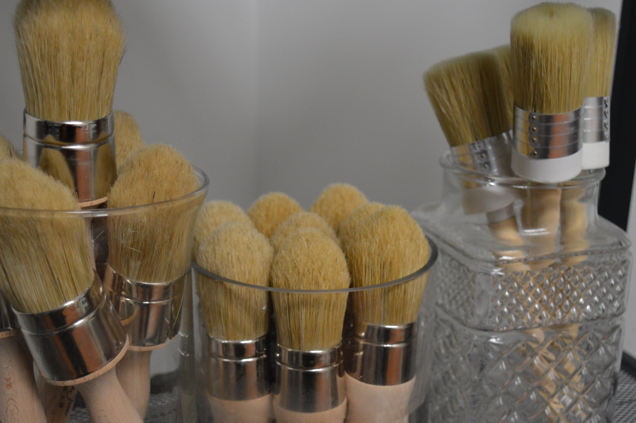
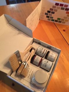
With some new skills and confidence from our hands-on studio session, I went back to see Katie for my next project, a more ambitious one that I would do on my own. With the Fourth of July holiday approaching, I would have more time to take on a project plus I knew Katie would be available if I needed anything. (Silk and Sage Design Studio is open both on Saturdays and Sundays.) Katie armed me with paints, brushes and details on how to paint the table on my own.
My project was a 25-year-old, well-worn pine dining table that would receive a brief sanding, followed by Chalk Paint® by Annie Sloan, followed by Crackle Tex by Artisan Enhancements®, and more Chalk Paint®. The Broyhill pine wood furniture bought in 1992 in New Jersey at a store with a dubious name, Unclaimed Freight, has lived a good life since leaving New Jersey, in California for a few years and in my Austin home’s dining room since 1998.
In recent years the table has been well used by my three young children who spill milk and occasionally nick it up with silverware. Last year, some lovely green placemats, a gift from Cambodia, graced the table. During one of the frequent milk-spilling incidents, we learned that those placemats are not colorfast. The table turned green, requiring permanent use of a table cloth. Now it was a prime candidate for a new paint job.
The table sits in a dining room where the decor is decidedly Americana. Wallpaper with a crackle-like finish adorns the bottom of the room, a green checked pattern dominates the top two-thirds of the walls and a border with a New England seaside scene in between. The decor evokes the style of the late Charles Wysocki, an artist who exclusively painted scenes of Americana.
Here are the Steps I Took to Make the Crackle Finish on a Wood Dining Table in a Weekend:
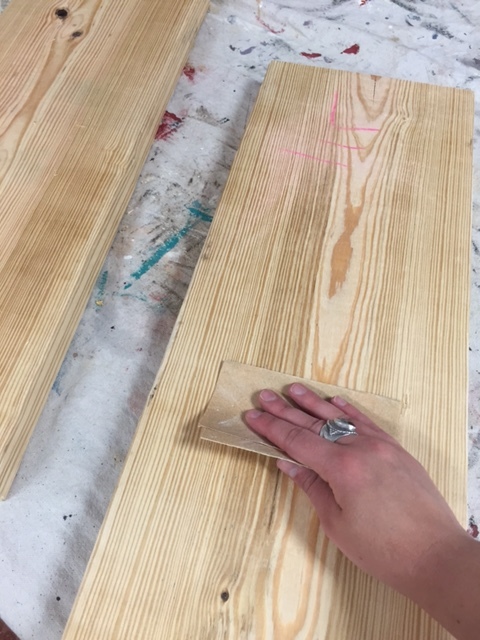
1. Friday night, I cleared the dinner table and took out a handheld sander. I lightly sanded the spots with the fork marks, the green dye from the placemats and a few other rough spots.
2. Next, I wiped down the entire table with a soft rag and followed it with dry rag. (If the sander and rag would not have been enough, I was prepared to use a little Krud Kutter. This brand has many products to help prepare and cleanup painted surfaces.)
3. Then I applied my first coat of Chalk Paint® in a color called Old Ochre, which is in the beige family, letting it dry for an hour.
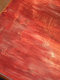
4. Next, I applied a thick coat of Crackle Tex, which when it sets, acts as the agent to crackle the finish of both the paint coat above and below it. I let this dry overnight.
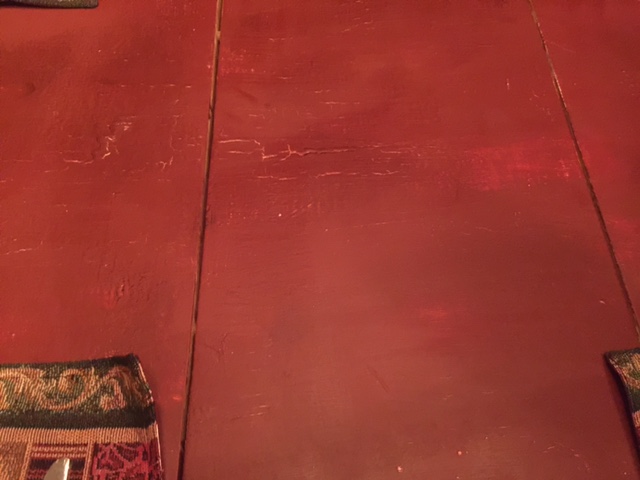
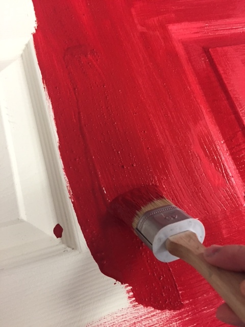
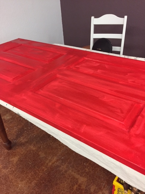
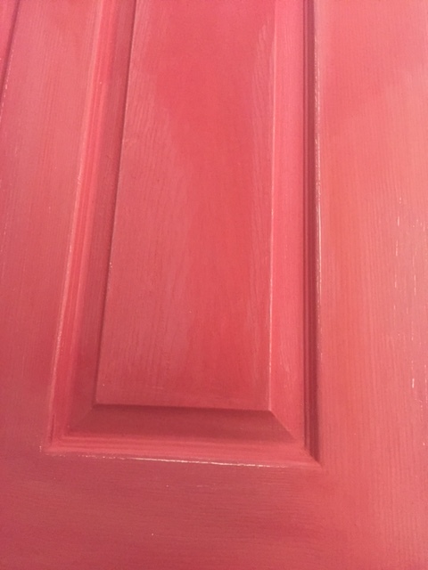
5. Then, Saturday morning I gave the table a thick coat of Primer Red. Primer Red actually looks like the color of an aging barn or farmhouse with its brown tones, perfect for a wood table in an Americana-style room.
6. To further activate the crackling, I sprayed a light spray of water on the entire surface and brushed it softly with a paint brush. I repeated this step three times on Saturday and early Sunday to get more deep, rich crackles and revealing the Old Ochre paint below.
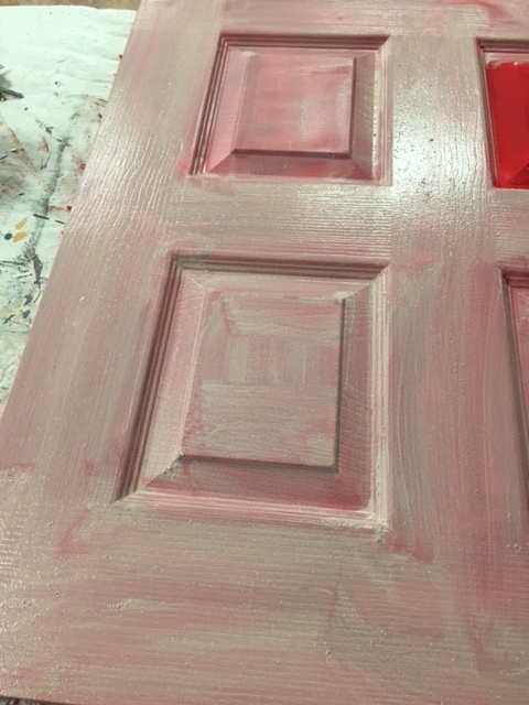
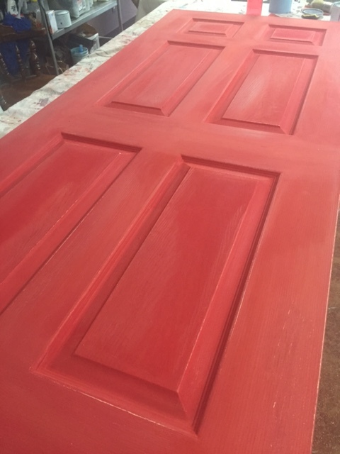
7. Once the water and red paint had fully dried by Sunday afternoon, I used a soft pure bristle brush to apply a coat of Annie Sloan’s Clear Soft Wax to give the table an allover smooth surface. I wiped off any extra with a soft shop towel, similar to a paper towel but thicker and without any lint.
8. Next, I used a small amount of Annie Sloan’s Dark Soft Wax (looks brown) to give the table a bit of an aged look. This was used sparingly. Dark Soft Wax is by far my favorite product since it gives any painted surface a dull, aged look.


Proud of my handiwork and glad that the techniques worked out so well, my dining room table feels new and fresh. It’s ready for brunch on Independence Day. Now I am cooking up my next project, which will likely be a wood desk for my eight year old to use for school work. Back-to-school days will be here before we know it.
DIY Reclaimed Door Shelves- Welcoming Miss Mustard Seed
Miss Mustard Seed comes to Austin, TX's Silk and Sage Design Studio! Learn about our fun, DIY reclaimed door shelving project to use for her product display.
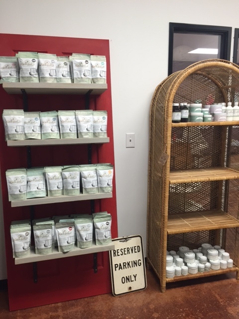
Things have been busy and bustling around the shop since we opened in March. We've been bringing on additional product lines that compliment what we already carry, and I'm so proud to say that we're now also a stockist of Miss Mustard Seed's Milk Paint, waxes, and painting sundries!
Naturally, we needed an epic and fitting way to display her product, and an idea that I had (inspired by Pinterest) was to repurpose an old door and attach wooden planks to it to function as shelves.
For those of you not familiar with milk paints or Miss Mustard Seed, I'll give you some background pending a fuller blog post on specifics. Milk Paints are a powdered milk and pigment paint that you mix yourself- usually using water. It's a traditional style of paint rather than a trademarked formula, however every brand recipe is of course unique. What was used in the prehistoric cave paintings? A form of milk paint. What's on that extremely chippy 200 year old French antique dresser at the antique mallI? A form of milk paint. I prefer Miss Mustard Seed's paints and sundries for many reasons, including the packaging, consistency when mixed, and the color options (oh my!). Yes I'm also biased because I now carry the line... but hopefully you'll have a chance to explore her line and mix paints yourself to see!
And so one day I set off to create our shelving unit while I waited for our products to arrive. To do this you'll need:
- cut wood planks (quantity determined by what spacing/how many shelves you want)
- 2 shelf brackets per shelf (one for each side)
- screws and screw anchors (for added security)
- drill and bits
- level
- door (quite possibly the most essential part!)
- paints or finish of choice
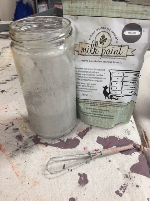
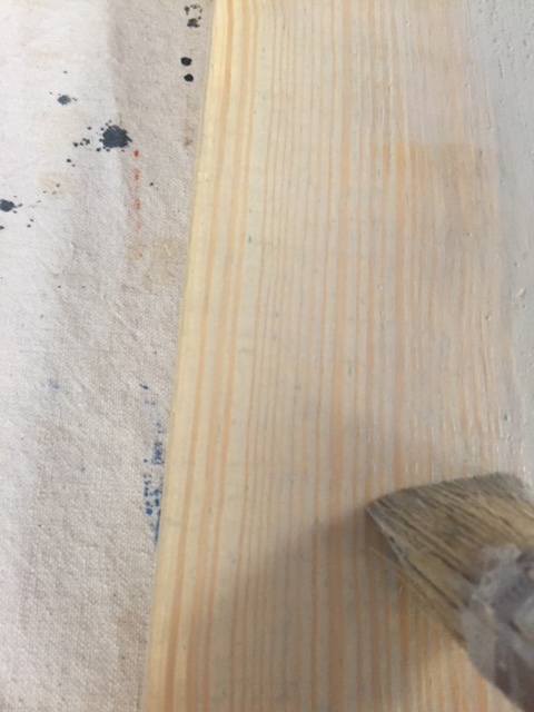
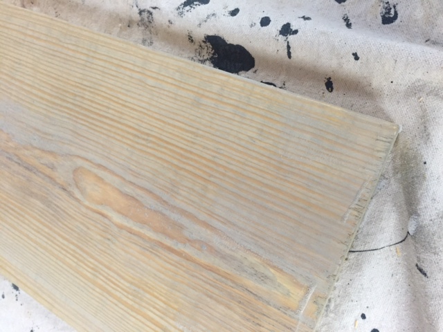
I had a raw wood plank cut so that each 'shelf' was the same length. If you do this you'll want to make sure you have shelves that are just the right width and depth, without being too heavy to be supported by the brackets (having the screw anchors will also help with securing the weight). Then I sanded off the splinters from each shelf, and made a lovely grey wash from a quart of the color Schloss. *Notice it comes in a resealable baggie!* Like a regular wash, the water was greater compared to the paint in the mix ratio. I applied in thin layers, to build up the color- raw wood will also absorb way more paint than sealed wood, so I always like to judge the color after it's dried.
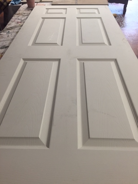
The door I chose definitely had some strange laminate/MDF finish to it, so besides cleaning thoroughly, I also sanded to recreate a tooth to the surface, and primed. With any milk paint, adherence to a slick or finished surface can be particular when just slapped on by itself. It's best to take the steps I did to provide the cleanest, most absorbant environment for the paint to be layered onto.
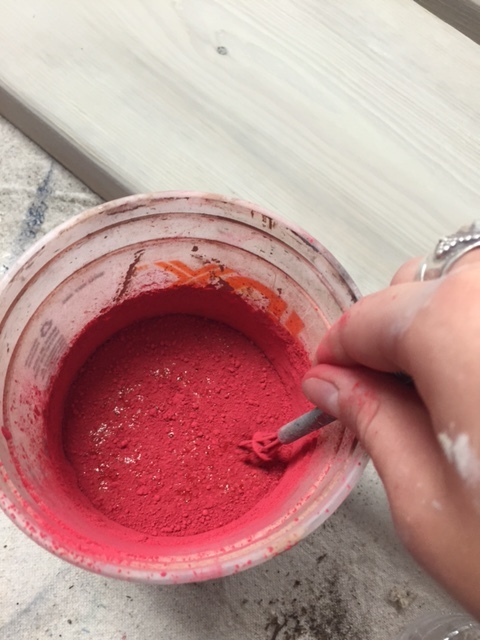
Additionally, adding Miss Mustard Seed's Bonding Agent (almost like a glue for the paint) into your mixture will greatly increase your success over a pre-finished surface. I chose the beautiful red, Tricycle, for the door. When mixing, it's best to begin with a 1:1 ratio of water to paint, adding more water or paint afterward to achieve the desired consistency. Mix it for a couple minutes to start, then let it sit for roughly 10 minutes to let the pigments fully disperse. You can whisk by hand, use a blender, or use one of her handy dandy electric mixers (looks like a latte milk frother). I did a thorough base coat of Tricycle to prepare for a 2 color distress technique.
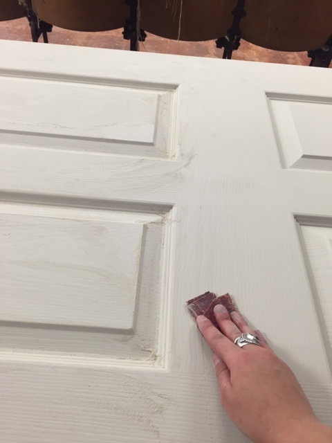
A thin coat of my leftover Schloss went on next, followed by one more coat of the Tricycle. I sanded lightly in areas to distress and give a look of barn wear-and-tear. Remember, less is often more with distressing. Miss Mustard Seed's Milk Paint is also more versatile than to only be used for rustic techniques- you CAN absolutely use it for sleek and modern techniques too!
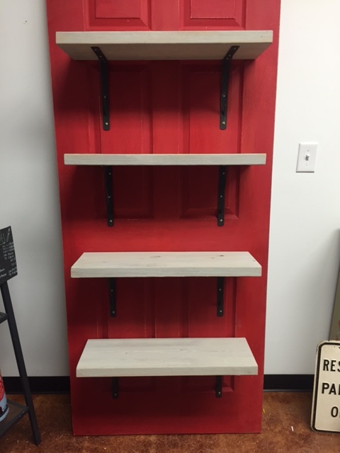
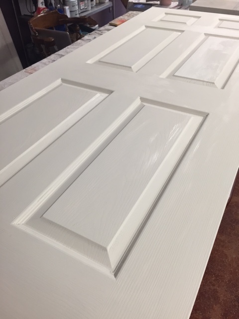
Once the paint dried, I waxed with her Furniture Wax (clear). I laid the door flat on the floor so it would be less strenuous for me to attach the shelves while holding them up at the same time. I had to play with the techniques and plan out my next course of action- measure twice, cut once! For me, the easiest way was to attach the brackets to each shelf first, then align them to the door to plot out my pilot holes for the screws. That way, once the pilot holes were drilled, I could just match the shelves and brackets up to them and screw them unto place with the anchors all at once! Then prop the door up to the wall... and voila! If you do this, your level will be your BFF for the last steps.
And now Miss Mustard Seed's product lines are sitting pretty. The reclaimed door shelving is mostly utilitarian, however we feel its whimsy fits her branding well.

Transformative Checkout Counter
How we created our checkout counter with Chalk Paint® by Annie Sloan.
I'll start with the end result!
A LOT has happened in our land. We've opened up shop! And you know what the means... the shop is never complete without a central checkout point. We decided to create ours in style. I had seen a photo on Pinterest (go figure) a few months back that inspired this. All I had to do was find a roughed up cabinet and buy some faux metal ceiling tile, and voila.
I had to first start at the top and peel off all the nasty veneer that was cracking. It's not super difficult, but there is a process. To do this at home you just need a damp rag and an iron that can reach a high steam setting. First you place your damp rag over the peeling veneer, then you set the hot iron on top, rotating in sections for about 10-15 seconds each. This top was stubborn so I needed to go around for a second time, but essentially what happens is that the hot moisture loosens the glue and then you can peel off the veneer in strips with a scraper!
Once all the real dirty work was done, I cut my faux tin tile to size and affixed it into the inset areas of the cabinet. I made sure that for the central section, the designs matched from top to bottom.
I added some Antibes Chalk Paint® over select areas. This will make sense later by imitating a metallic patina.
Super hot-mess status! I added some Barcelona Orange in select areas as well, to mimic rust. But, every project has a moment like this where it looks really scary and feels like you messed it up. Not to worry, like I said, carry on because it will all make sense later.
Looking a little bit more put together. A layer of Graphite helped complete the look.
Now for the icing layer! I distressed with corse steel wool and sandpaper to bring up the under tones.
I applied clear wax over the whole cabinet first, mainly to prevent the top surface from being vulnerable. After all, it will get lots of traffic! Then I took some dark wax to the high and low tile areas to further patina the surface.
And there you have it! I did it over two days, to let the paint fully dry over the faux tin tile. Since that part was plastic, it was a bit slick to paint over (same goes with metal or glass). But if you let the paint fully dry between coats it'll stick just fine!
Come check it out in person at our studio at 2700 W. Anderson Ln, Suite 228, Austin!
Musings on Color
Our thoughts on using colors within your interior, and color theory.
Let me just say that I LOVE earth tones. The more beige, gold, and all earthy relatives, the better. But I know that there's this strange and interesting thing that happens with people... that we all develop our own preferences, some of them purely personal and some of them culturally motivated. Gee, who would have thought that we all associate colors with different things?! Sarcasm aside, it truly is interesting and I always love to hear why someone has their favorite color palette (if they have a reason for it).
You probably remember learning about Primary colors, the color wheel, and ROYGBIV right? Some of us are immersed with this knowledge everyday because of our lines of work or out of pure enjoyment. It's easy to forget that there are actual Color Theories!
Take this color wheel for example. There are the basic names for color families, like reds and blues. We can simplify what a color is, yet there are so many tints-
tint /tint/
noun
1.
a shade or variety of color.
"the sky was taking on an apricot tint" (*as Google quotes)
Why do we not have more names for colors? Of course I know it depends on how our language developed and continues to, and in some cases we do have variation. Take the color Periwinkle for example. It's claimed as a blue, yet it does have its own name. Referring to it as blue is not wrong, nor is referring to it as Periwinkle. Some believe that Lavender and Periwinkle are synonymous, though they do have differences.


As you can see, both colors are somewhere in between purple and blue. But the main point here is that we all decide to group certain things together, and colors definitely fall under that category. The next level to examine then is color association. Why does one person perceive blue to be relaxing when another perceives it as cold? Again, personal feeling and emotion comes into play, but is often combined with cultural traditions. For example, some cultures maintain white as a color associated with mourning and do not use it in the home unless related to those purposes, while for others it is the hottest new minimal architecture and design trend.
Here is a small dissection of this by Apartment Therapy (do I love their photo-guided home and apartment tours!).
*photo credited to above article from Apartment Therapy, featured from their tour on Melinda & Mark's Creatively Curated Eagle Rock Home.
The bottom line I suppose is that we all like what we like. Sometimes that overlaps with trends and with what other people like. There are certainly classic color palettes for homes, offices, etc. for this reason. But we should also know when to embrace our preferences and break the mold! Part of why I am so passionate about my work, business, and enjoyment of DIY and furniture refinishing is that you can truly create your own dream. Let's all make that our motto for 2016 :).
Happy painting, designing, or whatever it is that you love to do.
xoxo